
require(mosaic)
set.seed(3141)  # for reproducibility
options(digits = 3) # to round everything to 3 digits
I'm going to load a dataset that is included with a standard R installation. It's the same old faithful data we used in Activity 13, but the variables are measured on a different scale.
Let's just go through some basic visualizations and summary statistics…
# Load the dataset
data(faithful)
# Look at the first several rows
head(faithful)
##   eruptions waiting
## 1      3.60      79
## 2      1.80      54
## 3      3.33      74
## 4      2.28      62
## 5      4.53      85
## 6      2.88      55
# Calculate the mean eruption time
mean(~eruptions, data = faithful)
## [1] 3.49
# Calculate the standard deviation
sd(~eruptions, data = faithful)
## [1] 1.14
# Calculate the variance
var(~eruptions, data = faithful)
## [1] 1.3
# Calculate the median
median(~eruptions, data = faithful)
## [1] 4
# Calculate quartiles
with(faithful, quantile(eruptions))
##   0%  25%  50%  75% 100%
## 1.60 2.16 4.00 4.45 5.10
# Calculate all the "standard" descriptive statistics
favstats(~eruptions, data = faithful)
##  min   Q1 median   Q3 max mean   sd   n missing
##  1.6 2.16      4 4.45 5.1 3.49 1.14 272       0
# Create histograms with different bin widths (or intervals)
histogram(~eruptions, data = faithful)
histogram(~eruptions, nint=20, data = faithful)

histogram(~eruptions, width=.1, data = faithful)

# Create histograms but only for data in which the waiting time is less than 75
histogram(~ eruptions, fit="normal", data=subset(faithful, waiting<=75))
## Loading required package: MASS

# Stemplot
with(faithful, stem(eruptions))
##
##   The decimal point is 1 digit(s) to the left of the |
##
##   16 | 070355555588
##   18 | 000022233333335577777777888822335777888
##   20 | 00002223378800035778
##   22 | 0002335578023578
##   24 | 00228
##   26 | 23
##   28 | 080
##   30 | 7
##   32 | 2337
##   34 | 250077
##   36 | 0000823577
##   38 | 2333335582225577
##   40 | 0000003357788888002233555577778
##   42 | 03335555778800233333555577778
##   44 | 02222335557780000000023333357778888
##   46 | 0000233357700000023578
##   48 | 00000022335800333
##   50 | 0370
# Dotplot
dotPlot(~ eruptions, data=faithful)

# Density Plot
densityplot(~ eruptions, data=faithful)

# Scatterplot
xyplot(waiting ~ eruptions, data=faithful)

# Scatterplot with lowess curve
xyplot(waiting ~ eruptions, type=c('p', 'smooth'), cex=.6, lwd=3, data=faithful)

# Scatterplot with best-fitting line and confidence/prediction intervals
xyplot(waiting~eruptions, panel=panel.lmbands, cex=.3, band.lwd=2, data=faithful)

# Correlation coefficient
cor(waiting, eruptions, data = faithful)
## [1] 0.901
I thought I'd include some other examples of graphs you could create with R. You can read the # Comments to follow along:
### Source:  http://lahman.r-forge.r-project.org/doc/Batting.html
## Create a plot of top batting averages over time
# Loads a baseball dataset
library(Lahman)
# Loads batting data
data(Batting)
# Loads a package that helps manipulate/reshape data
require('plyr')
# Look at the first several rows of data
head(Batting)
##    playerID yearID stint teamID lgID  G G_batting AB R H X2B X3B HR RBI SB
## 1 aardsda01   2004     1    SFN   NL 11        11  0 0 0   0   0  0   0  0
## 2 aardsda01   2006     1    CHN   NL 45        43  2 0 0   0   0  0   0  0
## 3 aardsda01   2007     1    CHA   AL 25         2  0 0 0   0   0  0   0  0
## 4 aardsda01   2008     1    BOS   AL 47         5  1 0 0   0   0  0   0  0
## 5 aardsda01   2009     1    SEA   AL 73         3  0 0 0   0   0  0   0  0
## 6 aardsda01   2010     1    SEA   AL 53         4  0 0 0   0   0  0   0  0
##   CS BB SO IBB HBP SH SF GIDP G_old
## 1  0  0  0   0   0  0  0    0    11
## 2  0  0  0   0   0  1  0    0    45
## 3  0  0  0   0   0  0  0    0     2
## 4  0  0  1   0   0  0  0    0     5
## 5  0  0  0   0   0  0  0    0    NA
## 6  0  0  0   0   0  0  0    0    NA
# calculate batting average and other stats
batting <- battingStats()

# add salary to Batting data; need to match by player, year and team
batting <- merge(batting,
                 Salaries[,c("playerID", "yearID", "teamID", "salary")],
                 by=c("playerID", "yearID", "teamID"), all.x=TRUE)
# Add name, age and bat hand information:
masterInfo <- Master[, c('playerID', 'birthYear', 'birthMonth',
                         'nameLast', 'nameFirst', 'bats')]
batting <- merge(batting, masterInfo, all.x = TRUE)
batting$age <- with(batting, yearID - birthYear -
                      ifelse(birthMonth < 10, 0, 1))
batting <- arrange(batting, playerID, yearID, stint)

## Generate a plot of batting average over time
# Restrict the pool of eligible players to the years after 1899 and
# players with a minimum of 450 plate appearances (this covers the
# strike year of 1994 when Tony Gwynn hit .394 before play was suspended
# for the season - in a normal year, the minimum number of plate appearances is 502)
eligibleHitters <- subset(batting, yearID >= 1900 & PA > 450)

# Find the hitters with the highest BA in MLB each year (there are a
# few ties).  Include all players with BA > .400
topHitters <- ddply(eligibleHitters, .(yearID), subset, (BA == max(BA))|BA > .400)

# Create a factor variable to distinguish the .400 hitters
topHitters$ba400 <- with(topHitters, BA >= 0.400)

# Sub-data frame for the .400 hitters plus the outliers after 1950
# (averages above .380) - used to produce labels in the plot below
bignames <- rbind(subset(topHitters, ba400),
                  subset(topHitters, yearID > 1950 & BA > 0.380))
# Cut to the relevant set of variables
bignames <- subset(bignames, select = c('playerID', 'yearID', 'nameLast',
                                        'nameFirst', 'BA'))

# Ditto for the original data frame
topHitters <- subset(topHitters, select = c('playerID', 'yearID', 'BA', 'ba400'))

# Positional offsets to spread out certain labels
#                     NL TC JJ TC GS TC RH GS HH RH RH BT TW TW  RC GB TG
bignames$xoffset <- c(0, 0, 0, 0, 0, 0, 0, 0, -8, 0, 3, 3, 0, 0, -2, 0, 0)
bignames$yoffset <- c(0, 0, -0.003, 0, 0, 0, 0, 0, -0.004, 0, 0, 0, 0, 0, -0.003, 0, 0)  +  0.002

# Load package for creating visualizations
require('ggplot2')
# Create the visualization
ggplot(topHitters, aes(x = yearID, y = BA)) +
  geom_point(aes(colour = ba400), size = 2.5) +
  geom_hline(yintercept = 0.400, size = 1) +
  geom_text(data = bignames, aes(x = yearID + xoffset, y = BA + yoffset,
                                 label = nameLast), size = 3) +
  scale_colour_manual(values = c('FALSE' = 'black', 'TRUE' = 'red')) +
  ylim(0.330, 0.430) +
  xlab('Year') +
  scale_y_continuous('Batting average',
                     breaks = seq(0.34, 0.42, by = 0.02),
                     labels = c('.340', '.360', '.380', '.400', '.420')) +
  geom_smooth() +
  theme(legend.position = 'none')

We could also look at the long-term trend of homeruns:
### Source: http://lahman.r-forge.r-project.org/doc/Batting.html

# Total home runs by year
totalHR <- ddply(Batting, .(yearID), summarise,
                 HomeRuns = sum(as.numeric(HR), na.rm=TRUE),
                 Games = sum(as.numeric(G_batting), na.rm=TRUE),
                 HRperGame = HomeRuns/Games
)
totalHR <- totalHR[ which(totalHR$Games>0), ]

# Quick look at the data
head(totalHR)
##   yearID HomeRuns Games HRperGame
## 1   1871       47  2296   0.02047
## 2   1872       35  3307   0.01058
## 3   1873       46  3603   0.01277
## 4   1874       40  4199   0.00953
## 5   1875       40  6249   0.00640
## 6   1876       40  4696   0.00852
# Plot trend (total homeruns / total games played)
# Add lowess smoothed line to see trend
ggplot(totalHR, aes(x=yearID, y=HRperGame)) +
  geom_point(shape=1, alpha=0.8) +    # Use hollow circles
  geom_smooth(alpha=0.3)            # Add a loess smoothed fit curve with confidence region

The pitchRx package allows you to analyze all the pitches thrown in baseball games. We'll examine the pitches thrown by Justin Verlander when he threw a no-hitter on May 7, 2011.
### Source:  http://cpsievert.github.io/pitchRx/
# Load the package
require(pitchRx)

## scrape pitchFX data from the Detroit vs Toronto game on May 7th, 2011
# To get all data from a particular set of dates, we'd use:
## scrape(start = "2011-05-07", end = "2011-05-07", suffix = "inning/inning_all.xml")
## I already know the Game ID of the game I want
GameData <- scrape(game.ids="gid_2011_05_07_detmlb_tormlb_1", suffix = "inning/inning_all.xml")
## http://gd2.mlb.com/components/game/mlb/year_2011/month_05/day_07/gid_2011_05_07_detmlb_tormlb_1/inning/inning_all.xml
# This gets us four dataframes: atbat, action, pitch, po

# Combine pitch and at-bat data
pitchFX <- join(GameData$pitch, GameData$atbat, by = c("num", "url"), type = "inner")
# This creates a dataframe with 69 columns
names(pitchFX)
##  [1] "des"             "des_es"          "id"
##  [4] "type"            "tfs"             "tfs_zulu"
##  [7] "x"               "y"               "cc"
## [10] "mt"              "url"             "inning_side"
## [13] "inning"          "next_"           "num"
## [16] "sv_id"           "start_speed"     "end_speed"
## [19] "sz_top"          "sz_bot"          "pfx_x"
## [22] "pfx_z"           "px"              "pz"
## [25] "x0"              "y0"              "z0"
## [28] "vx0"             "vy0"             "vz0"
## [31] "ax"              "ay"              "az"
## [34] "break_y"         "break_angle"     "break_length"
## [37] "pitch_type"      "type_confidence" "zone"
## [40] "nasty"           "spin_dir"        "spin_rate"
## [43] "on_1b"           "on_2b"           "on_3b"
## [46] "gameday_link"    "count"           "pitcher"
## [49] "batter"          "b"               "s"
## [52] "o"               "start_tfs"       "start_tfs_zulu"
## [55] "stand"           "b_height"        "p_throws"
## [58] "atbat_des"       "atbat_des_es"    "event"
## [61] "inning_side"     "inning"          "next_"
## [64] "score"           "home_team_runs"  "away_team_runs"
## [67] "batter_name"     "pitcher_name"    "gameday_link"
# Keep only the pitches thrown by Justin Verlander
pitches <- subset(pitchFX, pitcher_name == "Justin Verlander")
# Graph all the pitches thrown by JV
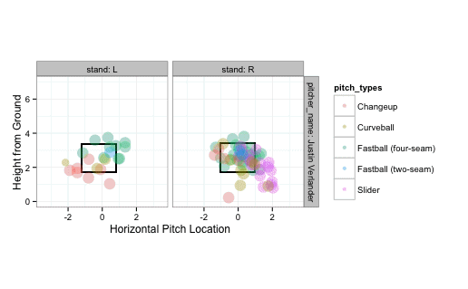
strikeFX(pitches, geom="tile", layer=facet_grid(.~stand))
## Warning: Removed 1 rows containing non-finite values (stat_density2d).
## Warning: Removed 2 rows containing non-finite values (stat_density2d).

The above graph shows the location of all the pitches Justin Verlander threw that day (to right- and left-handed batters). Let's look at just the called strikes:
strikes <- subset(pitches, des == "Called Strike")
strikeFX(strikes, geom="tile", layer=facet_grid(.~stand))

… and the swinging strikes:
swingstrikes <- subset(pitches, des == "Swinging Strike")
strikeFX(swingstrikes, geom="tile", layer=facet_grid(.~stand))

… and the balls:
balls <- subset(pitches, des == "Ball")
strikeFX(balls, geom="tile", layer=facet_grid(.~stand))
## Warning: Removed 1 rows containing non-finite values (stat_density2d).
## Warning: Removed 2 rows containing non-finite values (stat_density2d).

We can see the results of all pitches thrown to right-handed batters. B = Ball S = Strike X = Hit into play
Righties <- subset(pitches, stand=="R")
install.packages("ggsubplot")
## Error: trying to use CRAN without setting a mirror
strikeFX(Righties, geom="subplot2d", fill="type")
## Error: At least one layer must contain all variables used for facetting
We can even have the computer estimate the probability of a strike based on the location of the pitch.
noswing <- subset(pitches, des %in% c("Ball", "Called Strike"))
noswing$strike <- as.numeric(noswing$des %in% "Called Strike")
require(mgcv)
m1 <- bam(strike ~ s(px, pz, by=factor(stand)) +
          factor(stand), data=noswing, family = binomial(link='logit'))
## Error: Model has more coefficients than data
strikeFX(noswing, model=m1, layer=facet_grid(.~stand))
## Error: could not find function "m1"
When pitching to left-handed batters, it looks like high pitches have a higher chance of being called strikes.
Finally, here's an animation of all the pitches from Justin Verlander during this game:
animateFX(pitches, layer=list(facet_grid(pitcher_name~stand, labeller = label_both), theme_bw(), coord_equal()))

require(animation)
ani.options(interval = 0.05)
saveHTML({animateFX(pitches, layer=list(facet_grid(pitcher_name~stand, labeller = label_both), theme_bw(), coord_equal()))}, img.name="JVpitches")
Let's download a big dataset of baby names:
# Install a package with the baby names dataset
devtools::install_github("hadley/babynames")
require(babynames)
# Save the dataset as "babies"
babies <- babynames
# See the first several rows
head(babies)
##   year sex      name    n   prop
## 1 1880   F      Mary 7065 0.0724
## 2 1880   F      Anna 2604 0.0267
## 3 1880   F      Emma 2003 0.0205
## 4 1880   F Elizabeth 1939 0.0199
## 5 1880   F    Minnie 1746 0.0179
## 6 1880   F  Margaret 1578 0.0162
This dataset (from the Social Security Administration) lists names with at least 5 uses each year. It's ordered by the proportion of babies given each name, so you can see Mary was the most popular name for a girl in 1880 (with 7% of girls being given that name).
Let's arbitrarily choose a name and see how it changed in popularity over time.
# Choose the name "Bradley"
bradley <- subset(babies, name == "Bradley")
# Quick line plot of name popularity
qplot(x = year, y = prop, data = bradley, geom = 'line', group = sex, colour=sex)

It looks like Bradley peaked in the early 1980s (although it was also somewhat popular when I was born in 1976).
Let's choose another name:
# Choose the name "Trinity"
trinity <- subset(babies, name == "Trinity")
# Quick line plot of name popularity
qplot(x = year, y = prop, data = trinity, geom = 'line', group = sex, colour=sex)

The name Trinity really peaked in the early 2000s. It just so happens the name was a character from The Matrix.