---
title: "NCF Metrics"
output:
flexdashboard::flex_dashboard:
theme: spacelab
vertical_layout: fill
navbar:
- { title: "BOG PBF Info", href: "https://www.flbog.edu/finance/performance-based-funding/", align: right }
source_code: embed
self_contained: TRUE
---
```{r packages, include=FALSE, message=FALSE, warning=FALSE}
# Load packages
library(flexdashboard)
library(googlesheets4)
library(tidyverse)
library(ggiraph)
library(scales)
library(kableExtra)
library(gt)
library(htmltools)
library(highcharter)
# library(plotly)
```
```{r parameters, include=FALSE}
## Select year of most recent (and oldest) data
yearold <- 2012
yearnew <- 2021
yearend <- 2028
```
```{r themes, include=FALSE}
# ggplot theme
custom_plot <- list(
theme(
plot.title = element_text(color="#000000", size=15),
axis.title.x = element_text(color="grey50", size=14),
axis.title.y = element_text(color="grey50", size=14),
axis.text.x = element_text(color="grey50", size=14),
axis.text.y = element_text(color = "grey50", size=14),
legend.position = "none",
panel.grid.major = element_line(colour = "white"),
panel.grid.minor = element_blank(),
panel.background = element_rect(fill = "grey95"))
)
# Create the benchmark ribbons (RYG)
benchmark_ribbons <- list(geom_ribbon(data = . %>% filter(unitid==262129),
aes(x = datayear, ymin = 0, ymax=b1), fill = "#D6641E", alpha=0.2),
geom_ribbon(data = . %>% filter(unitid==262129),
aes(x = datayear, ymin = b7, ymax=b10), fill = "#F0E54B", alpha=0.2),
geom_ribbon(data = . %>% filter(unitid==262129),
aes(x = datayear, ymin = b10, ymax=100000), fill = "#2B9F78", alpha=0.2))
```
```{r googlesheets4, include=FALSE, warning=FALSE, message=FALSE}
# Set ID for datafile (allow anyone with link)
GSid <- "1LaShcPHxKVdnNB00EZ5WNo6UW2eRCF83Zx__5ojbYdM"
# Download GSheet
gs4_deauth()
gs4_get(GSid)
```
```{r data, include=FALSE, error=FALSE, warning=FALSE}
# Load names, years, and benchmarks
m_info <- read_sheet(GSid, sheet = "info", skip = 0, n_max = 200,
col_names=TRUE, col_types = "cccccnnccnnnnnnnnnnn")
# Separate into data frames
metric_names <- m_info %>%
select(metric1:name_long) %>%
rename(metric = metric1) %>%
filter(!is.na(metric))
years <- m_info %>%
select(metric2:fundingyear) %>%
rename(metric = metric2) %>%
filter(!is.na(metric))
benchmarks <- m_info %>%
select(metric3:b10) %>%
rename(metric = metric3,
datayear = datayear2) %>%
filter(!is.na(datayear))
# Load enrollment, rank, and satisfaction
m_res <- read_sheet(GSid, sheet = "rank_enroll_satisfaction", skip = 0, n_max = 200,
col_names=TRUE, col_types = "nnncnnnccncnnn")
# Separate into data frames
enroll <- m_res %>%
select(year1:Goal) %>%
rename(year = year1) %>%
pivot_longer(-year, names_to = "type", values_to = "students") %>%
filter(!is.na(year))
rank <- m_res %>%
select(year2:WM) %>%
rename(year = year2) %>%
pivot_longer(-year, names_to = "source", values_to = "ranking") %>%
filter(!is.na(year))
satisfaction <- m_res %>%
select(year3:interpolated) %>%
rename(year = year3) %>%
filter(!is.na(year))
# Total scores
total <- read_sheet(GSid, sheet = "score", skip = 0, col_names=TRUE, col_types="cncnnnnnn") %>%
arrange(year)
total_wide <- total %>%
pivot_wider(id_cols = c(metric, school),
names_from = year,
values_from = c(excellence, improvement, score))
# Calculate total excellence and improvement scores
total_score <- total %>%
mutate(school = factor(school)) %>%
group_by(school, year) %>%
summarize(excellence = sum(excellence, na.rm=T),
improvement = sum(improvement, na.rm=T),
score = sum(score, na.rm=T),
excPLUSimp = excellence+improvement) %>%
arrange(desc(score))
# Pivot longer
total_score_long <- total_score %>%
pivot_longer(-c("school", "year"), names_to="type", values_to="score") %>%
# Change type for the most recent year (to color it in plot)
mutate(type = case_when(
year == 2021 & type == "excellence" ~ "zexcellence",
year == 2021 & type == "improvement" ~ "zimprovement",
year == 2021 & type == "score" ~ "zscore",
year < 2021 & type == "excellence" ~ "excellence",
year < 2021 & type == "improvement" ~ "improvement",
year < 2021 & type == "score" ~ "score",
type == "excPLUSimp" ~ "excPLUSimp"
))
total_score_long_2 <- total_score %>%
pivot_longer(-c("school", "year"), names_to="type", values_to="score")
# Load metrics performance
metrics_unprocessed <- read_sheet(GSid, sheet = "unprocessed", skip = 0,
col_names=TRUE, col_types = "cnccnnnnnnnnnnnnnn") %>%
filter(!is.na(metric)) %>%
pivot_longer(
cols = starts_with("20"),
names_to = "datayear",
values_to = "outcome") %>%
mutate(datayear = as.numeric(datayear)) %>%
arrange(metric, school, datayear)
extrastuff <- read_sheet(GSid, sheet = "extrastuff", skip = 0,
col_names=TRUE, col_types = "cnnnnncnnnnn")
# Join into complete dataset
PBF <- metrics_unprocessed %>%
full_join(benchmarks, by = c("metric", "datayear")) %>%
full_join(metric_names) %>%
full_join(years) %>%
# Add group minimums and maximums
group_by(metric, group, datayear) %>%
mutate(min_outcome = min(outcome, na.rm=T),
max_outcome=max(outcome, na.rm=T),
median_outcome=median(outcome, na.rm=T),
min_outcome = na_if(min_outcome, "Inf"), # Replace infinity with
min_outcome = na_if(min_outcome, "-Inf"), # missing values.
max_outcome = na_if(max_outcome, "Inf"), # When all data were missing
max_outcome = na_if(max_outcome, "-Inf"),
median_outcome = na_if(median_outcome, "Inf")) # the min/max are infinity.
# Full retention data
retain <- read_sheet(GSid, sheet = "retain", skip = 0,
col_names=TRUE, col_types = "nccnnnnnnnnnnnnnnnnnnnnnnnnnnn") %>%
pivot_longer(cols = c(-unitid, -school, -group, -peer),
names_to = "datayear", values_to = "outcome") %>%
mutate(datayear = as.numeric(datayear)) %>%
arrange(school, datayear) %>%
add_column(metric = as.character(5)) %>%
full_join(benchmarks, by = c("metric", "datayear")) %>%
full_join(metric_names) %>%
full_join(years) %>%
# Add group minimums and maximums
group_by(group, datayear) %>%
mutate(min_outcome = min(outcome, na.rm=T),
max_outcome=max(outcome, na.rm=T),
median_outcome=median(outcome, na.rm=T),
min_outcome = na_if(min_outcome, "Inf"), # Replace infinity with
min_outcome = na_if(min_outcome, "-Inf"), # missing values.
max_outcome = na_if(max_outcome, "Inf"), # When all data were missing
max_outcome = na_if(max_outcome, "-Inf"),
median_outcome = na_if(median_outcome, "Inf")) # the min/max are infinity.
# Full grad rate data
grad <- read_sheet(GSid, sheet = "grad", skip = 0,
col_names=TRUE, col_types = "cnccnnnnnnnnnnnnnnnnnnnnnnnnnnnn") %>%
pivot_longer(cols = c(-metric, -unitid, -school, -group, -peer),
names_to = "datayear", values_to = "outcome") %>%
mutate(datayear = as.numeric(datayear)) %>%
arrange(school, datayear) %>%
full_join(benchmarks, by = c("metric", "datayear")) %>%
full_join(metric_names) %>%
full_join(years) %>%
# Add group minimums and maximums
group_by(group, datayear) %>%
mutate(min_outcome = min(outcome, na.rm=T),
max_outcome=max(outcome, na.rm=T),
median_outcome=median(outcome, na.rm=T),
min_outcome = na_if(min_outcome, "Inf"), # Replace infinity with
min_outcome = na_if(min_outcome, "-Inf"), # missing values.
max_outcome = na_if(max_outcome, "Inf"), # When all data were missing
max_outcome = na_if(max_outcome, "-Inf"),
median_outcome = na_if(median_outcome, "Inf")) # the min/max are infinity.
# Full Pell rate data
pell <- read_sheet(GSid, sheet = "pell", skip = 0,
col_names=TRUE, col_types = "cnccnnnnnnnnnnnnnnnnnnnnnn") %>%
pivot_longer(cols = c(-metric, -unitid, -school, -group, -peer),
names_to = "datayear", values_to = "outcome") %>%
mutate(datayear = as.numeric(datayear)) %>%
arrange(school, datayear) %>%
full_join(benchmarks, by = c("metric", "datayear")) %>%
full_join(metric_names) %>%
full_join(years) %>%
# Add group minimums and maximums
group_by(group, datayear) %>%
mutate(min_outcome = min(outcome, na.rm=T),
max_outcome=max(outcome, na.rm=T),
median_outcome=median(outcome, na.rm=T),
min_outcome = na_if(min_outcome, "Inf"), # Replace infinity with
min_outcome = na_if(min_outcome, "-Inf"), # missing values.
max_outcome = na_if(max_outcome, "Inf"), # When all data were missing
max_outcome = na_if(max_outcome, "-Inf"),
median_outcome = na_if(median_outcome, "Inf")) # the min/max are infinity.
# Create data frame of all metric scores
metric_scores <- total %>%
select(-(excellence2020:score2020)) %>%
mutate(metric = factor(metric, levels = c("1", "2", "3", "4", "5", "6", "7", "8a", "8b", "9", "9a", "9b", "10"))) %>%
arrange(school, metric) %>%
pivot_wider(id_cols = c(school, metric), names_from = c(year), values_from = c(excellence, improvement, score))
# Create data frame of all total scores
tsw <- total_score %>%
filter(year == 2021) %>%
pivot_wider(id_cols = c(school), names_from = c(year), values_from = c(excellence, improvement, score, excPLUSimp)) %>%
rename("exc" = "excellence_2021",
"imp" = "improvement_2021",
"sum" = "excPLUSimp_2021",
"score" = "score_2021") %>%
select(school, exc, imp, sum, score) %>%
arrange(score)
# Create data frame of NCF total scores
sus_scores <- total_score %>%
pivot_longer(cols = c(excellence, improvement, excPLUSimp, score), names_to= "type", values_to="score") %>%
mutate(type = case_when(
type == "excellence" ~ "Excellence Points",
type == "improvement" ~ "Improvement Points",
type == "excPLUSimp" ~ "Excellence + Improvement",
type == "score" ~ "Final Score"
)) %>%
pivot_wider(id_cols = c(school, type), names_from = c(year), values_from = c(score)) %>%
relocate("school", "type", "2016", "2017", "2018", "2019", "2020", "2021")
sus_2021 <- sus_scores %>%
select(school, type, "2021") %>%
pivot_wider(id_cols = c("type"), names_from = c(school), values_from = c("2021")) %>%
# Reorder to match plot
relocate("type", "FIU", "USF", "FSU", "UCF", "UF", "FAU", "FPU",
"UWF", "FGCU", "FAMU", "UNF", "NCF") %>%
rename("PBF Score" = "type")
rm(m_info, m_res, metrics_unprocessed)
# Load enrollment, rank, and satisfaction
m_res <- read_sheet(GSid, sheet = "rank_enroll_satisfaction", skip = 0, n_max = 200,
col_names=TRUE, col_types = "nnncnnnccncnnn")
# Separate into data frames
enroll <- m_res %>%
select(year1:Goal) %>%
rename(year = year1) %>%
pivot_longer(-year, names_to = "type", values_to = "students") %>%
filter(!is.na(year))
rank <- m_res %>%
select(year2:WM) %>%
rename(year = year2) %>%
pivot_longer(-year, names_to = "source", values_to = "ranking") %>%
filter(!is.na(year))
satisfaction <- m_res %>%
select(item:interpolated) %>%
rename(year = year3) %>%
filter(!is.na(year))
```
SP {data-orientation=rows data-icon="fa-question-circle" style="position:relative;"}
=======================================================================
Row {data-height=1}
-----------------------------------------------------------------------
### **Why?**New College of Florida prepares intellectually curious students for lives of great achievement.
Row {data-height=285}
-----------------------------------------------------------------------
### **Where?**Top 20 liberal arts college in the nation.{data-padding=8}
```{r ranking, fig.width=17, fig.height=5}
poly <- tibble(
year = c(2006, 2040, 2040, 2006, 2006),
ranking = c(20, 20, 1, 1, 20))
highchart() %>%
hc_chart(plotBackgroundColor="rgba(235,235,235,0.9") %>%
hc_legend(enabled = FALSE) %>%
hc_xAxis(min = 2004.8, max = 2040, tickInterval = 2, endOnTick = FALSE, description = "Year",
gridLineColor="white", minorGridLineColor="white", minorTicks=TRUE, minorTickInterval=2,
labels = list(enabled=TRUE, style = list(fontSize = "12px", color = "grey")),
title = list(style = list(fontSize = "16px", fontWeight = "bold",
color = "rgba(100,100,100,1"))) %>%
hc_yAxis(min = 1, max = 150, tickInterval = 20, endOnTick = FALSE, description = "national ranking",
gridLineColor="white", minorGridLineColor="white", startOnTick=FALSE, floor=1,
minorTicks = TRUE, minorTickInterval = 20, reversed=TRUE, rotate=90,
title = list(text = "National Ranking", style = list(fontSize = "14px",
color = "rgba(100,100,100,1)")),
labels = list(enabled=TRUE, x=-5, style = list(fontSize = "13px", color = "grey"))) %>%
hc_add_series(poly, type = 'polygon', hcaes(x=year, y=ranking),
color = list(linearGradient = list(x1=0, y1=0, x2=1, y2=0),
stops = list(
list(0, "transparent"),
list(0.1, "rgba(249,217,73,0.1)"),
list(0.5, "rgba(249,217,73,0.5)"),
list(1, "rgba(249,217,73,0.9)")
)), enableMouseTracking = FALSE) %>%
hc_add_series(filter(rank, source=="USnews"), "line", marker = list(symbol="circle"),
hcaes(x = year, y = ranking), lineWidth=4, color="#0066CC", name = "US News Ranking") %>%
hc_add_series(filter(rank, source=="USnews" & year==2021), "scatter", hcaes(x = year, y = ranking),
color="#0066CC", marker = list(radius=3, symbol="circle"),
name = "US News Ranking", enableMouseTracking = FALSE,
dataLabels = list(enabled = TRUE, backgroundColor = "#0066CC", color="white",
verticalAlign="middle", padding=2, crop=FALSE, overflow="allow",
style = list(fontSize = "13px", textOutline=0))) %>%
hc_add_series(filter(rank, source=="WM"), "line", marker = list(symbol="circle"),
hcaes(x = year, y = ranking), lineWidth=4, color="rgb(125,125,125)",
name = "Washington Monthly") %>%
hc_add_series(filter(rank, source=="WM" & year==2021), "scatter", hcaes(x = year, y = ranking),
color="rgb(125,125,125)", marker = list(radius=3, symbol="circle"),
name = "Washington Monthly", enableMouseTracking = FALSE,
dataLabels = list(enabled = TRUE, backgroundColor = "rgb(125,125,125)", color="white",
verticalAlign="middle", padding=2, crop=FALSE, overflow="allow",
style = list(fontSize = "13px", textOutline=0))) %>%
hc_add_annotation(labels = list(list(align="left", backgroundColor="rgba(0,0,0,0)", borderWidth=0,
borderColor="#0066CC", padding=3, shadow=FALSE,
verticalAlign="bottom", allowOverlap=TRUE, y=10, x=10,
point = list(xAxis = 0, yAxis = 0, x = 2021.5, y = 82),
text = "US News",
style=list(color="#0066CC", fontSize="14px")))) %>%
hc_add_annotation(labels = list(list(align="left", backgroundColor="rgba(0,0,0,0)",
borderWidth=0, borderColor="rgba(125,125,125,.8)",
padding=3, shadow=FALSE, verticalAlign="bottom",
allowOverlap=TRUE, y=10, x=10,
point = list(xAxis = 0, yAxis = 0, x = 2021.5, y = 54),
text = "Washington Monthly",
style=list(color="rgb(125,125,125)", fontSize="14px")))) %>%
hc_add_annotation(labels = list(list(align="left", backgroundColor="rgba(0,0,0,0)", borderWidth=0,
padding=3, shadow=FALSE, verticalAlign="top", horizontalAlign="right",
allowOverlap=TRUE, y=0, x=10,
point = list(xAxis = 0, yAxis = 0, x = 2039, y = 5),
text = "long-term goal: top 20", style=list(color="#000000",
fontSize="14px"))))
```
Row {data-height=335 style="height:10pc"}
-----------------------------------------------------------------------
### **What?**1200 students by 2025? {data-width=50 data-padding=3}
```{r enrollmentgoals, fig.width=9, fig.height=5}
poly <- tibble(
year = c(2004, 2020, 2020, 2004, 2004),
students = c(690, 855, 1016, 755, 690))
project <- tibble(
year = c(2017:2025),
students_growth = c(875, 900, 950, 1025, 1100, 1200, NA, NA, NA),
students_sp = c(NA, NA, 860, 900, 975, 1075, 1200, NA, NA),
students_new = c(NA, NA, NA, NA, 620, 630, 665, 700, 750)
)
highchart() %>%
hc_chart(plotBackgroundColor="rgba(235,235,235,1") %>%
hc_legend(enabled = FALSE) %>%
hc_xAxis(min = 2003.8, max = 2026.5, tickInterval = 2, endOnTick = FALSE, description = "year",
gridLineColor="white", minorGridLineColor="white", minorTicks=TRUE, minorTickInterval=2,
labels = list(enabled=TRUE, style = list(fontSize = "12px", color = "grey")),
title = list(style = list(fontSize = "16px", fontWeight = "bold",
color = "rgba(100,100,100,1"))) %>%
hc_yAxis(min = 600, max = 1250, tickInterval = 100, endOnTick = FALSE, description = "enrollment",
gridLineColor="white", minorGridLineColor="white", minorTicks=TRUE, minorTickInterval=1,
title = list(text = "enrollment", style = list(fontSize = "14px",
color = "rgba(100,100,100,1)")),
labels = list(enabled=TRUE, x=-5, style = list(fontSize = "13px", color = "grey"))) %>%
hc_add_series(poly, type = 'polygon', hcaes(x=year, y=students),
color = hex_to_rgba("#0066CC", 0.2), enableMouseTracking = FALSE) %>%
hc_add_series(project, "line", marker = list(symbol="circle"),
hcaes(x = year, y = students_growth), lineWidth=4,
color="#BBBBBB", name = "growth plan", dashStyle = "ShortDash") %>%
hc_add_series(project, "line", marker = list(symbol="circle"),
hcaes(x = year, y = students_sp), lineWidth=4,
color="#AAAAAA", name = "strategic plan", dashStyle = "ShortDash") %>%
hc_add_series(project, "line", marker = list(symbol="circle"),
hcaes(x = year, y = students_new), lineWidth=4,
color="#AAAAAA", name = "2021 Accountability Plan", dashStyle = "ShortDash") %>%
hc_add_series(filter(enroll, type=="NCF"), "line", marker = list(symbol="circle"),
hcaes(x = year, y = students), lineWidth=4, color="#0066CC", name = "students") %>%
hc_add_series(filter(enroll, type=="NCF" & year==2021), "scatter", hcaes(x = year, y = students),
color="#0066CC", marker = list(radius=3, symbol="circle"), name = "students",
enableMouseTracking = FALSE,
dataLabels = list(enabled = TRUE, backgroundColor = "#0066CC", color="white",
verticalAlign="middle", padding=2, crop=FALSE, overflow="allow",
style = list(fontSize = "13px", textOutline=0))) %>%
# hc_add_series(filter(enroll, type=="Goal" & year <= 2020), "line", hcaes(x = year, y = students), name="goal",
# marker = list(enabled=FALSE), lineWidth=4, color="rgba(150,150,150,1)") %>%
# hc_add_series(filter(enroll, type=="Goal" & year >2020 & year <= 2024), "line", hcaes(x = year, y = students),
# marker = list(enabled=FALSE), lineWidth=4, color="rgba(150,150,150,1)", name = "goal",
# dataLabels = list(enabled = TRUE, backgroundColor = "rgba(150,150,150,1)", color="rgba(255,255,255,1)",
# verticalAlign="middle", padding=2, crop=FALSE, overflow="allow",
# allowOverlap=TRUE, style = list(fontSize = "13px", textOutline=0))) %>%
hc_add_series(project, "line", hcaes(x = year, y = students_new),
lineWidth=4, color="rgba(249,217,73,1)", name = "goal",
dataLabels = list(enabled = TRUE, backgroundColor = "rgba(249,217,73,1)",
color="rgba(50,50,50,1)", verticalAlign="middle", padding=2, crop=FALSE,
overflow="allow", borderWidth=1, borderColor="rgb(50,50,50)",
style = list(fontSize = "13px", textOutline=0))) %>%
# hc_add_annotation(labels = list(list(align="left", backgroundColor="rgba(0,0,0,0)", borderWidth=0,
# padding=3, shadow=FALSE, verticalAlign="top", horizontalAlign="right",
# allowOverlap=TRUE, y=0, x=10,
# point = list(xAxis = 0, yAxis = 0, x = 2025, y = 800),
# text = "Goals", style=list(color="rgba(50,50,50,1)",
# fontSize="14px")))) %>%
hc_add_annotation(labels = list(list(align="left", backgroundColor="rgba(0,0,0,0)", borderWidth=0,
padding=3, shadow=FALSE, verticalAlign="top", horizontalAlign="right",
allowOverlap=TRUE, y=0, x=10,
point = list(xAxis = 0, yAxis = 0, x = 2022.5, y = 1100),
text = "SP", style=list(color="#AAAAAA",
fontSize="14px")))) %>%
hc_add_annotation(labels = list(list(align="right", backgroundColor="rgba(0,0,0,0)", borderWidth=0,
padding=3, shadow=FALSE, verticalAlign="top", horizontalAlign="right",
allowOverlap=TRUE, y=0, x=10,
point = list(xAxis = 0, yAxis = 0, x = 2020.5, y = 1170),
text = "Growth", style=list(color="#BBBBBB",
fontSize="14px"))))
```
### **What?**80% 4-year grad rate {data-width=50 data-padding=3}
```{r gradrategoals, fig.width=6, fig.height=4}
polygrad <- tibble(
year = c(2005, 2021, 2021, 2005, 2005),
rate = c(43, 54, 73, 55, 43))
highchart() %>%
hc_chart(plotBackgroundColor="rgba(235,235,235,1") %>%
hc_legend(enabled = FALSE) %>%
hc_xAxis(min = 2003.8, max = 2029, tickInterval = 2, endOnTick = FALSE, description = "year",
gridLineColor="white", minorGridLineColor="white", minorTicks=TRUE, minorTickInterval=2,
labels = list(enabled=TRUE, style = list(fontSize = "12px", color = "grey")),
title = list(style = list(fontSize = "16px", fontWeight = "bold",
color = "rgba(100,100,100,1"))) %>%
hc_yAxis(min = 20, max = 101, tickInterval = 20, endOnTick = FALSE,
description = "4-year graduation rate", gridLineColor="white", minorGridLineColor="white",
startOnTick=FALSE, floor=1, minorTicks = TRUE, minorTickInterval = 20, reversed=FALSE,
title = list(text = "4-year graduation rate",
style = list(fontSize = "14px", color = "rgba(100,100,100,1)")),
labels = list(enabled=TRUE, x=-5, style = list(fontSize = "13px", color = "grey"))) %>%
hc_add_series(polygrad, type = 'polygon', hcaes(x=year, y=rate),
color = hex_to_rgba("#0066CC", 0.2), enableMouseTracking = FALSE) %>%
hc_add_series(filter(grad, unitid==262129), "line", marker = list(symbol="circle"),
hcaes(x = datayear, y = outcome), lineWidth=4, color="#0066CC", name = "NCF") %>%
hc_add_series(filter(grad, group=="Top25" & datayear>2003), "line", marker = list(enabled=FALSE),
hcaes(x = datayear, y = outcome, group=unitid), lineWidth=1, color="rgba(25,25,25,.15)",
name = "Top 25 Liberal Arts", enableMouseTracking = FALSE) %>%
hc_add_series(filter(grad, unitid==999999 & datayear > 2021), "line", marker = list(enabled=FALSE),
hcaes(x = datayear, y = outcome), lineWidth=3, color="rgba(150,150,150,1)", name = "Goal") %>%
hc_add_series(filter(grad, unitid==999999 & datayear%%2==0 & datayear<2028 & datayear>2020), "scatter",
hcaes(x = datayear, y = outcome), color="rgba(150,150,150,1)", marker = list(enabled=FALSE),
name = "Goal", enableMouseTracking = FALSE,
dataLabels = list(enabled = TRUE, backgroundColor = "rgba(150,150,150,1)", color="rgba(255,255,255,1)",
verticalAlign="middle", padding=3, crop=FALSE, overflow="allow",
style = list(fontSize = "13px", textOutline=0))) %>%
hc_add_series(filter(grad, unitid==999999 & datayear==2028), "scatter", hcaes(x = datayear, y = outcome),
color="rgb(180,180,180)", marker = list(enabled=FALSE), name = "Goal",
enableMouseTracking = FALSE,
dataLabels = list(enabled = TRUE, backgroundColor = "rgba(249,217,73,1)",
color="rgb(50,50,50)", borderWidth=1, borderColor="rgb(50,50,50)",
verticalAlign="middle", padding=3, crop=FALSE, overflow="allow",
style = list(fontSize = "13px", textOutline=0))) %>%
hc_add_series(filter(grad, unitid==262129 & datayear==2021), "scatter", hcaes(x = datayear, y = outcome),
color="#0066CC", marker = list(enabled=FALSE), name = "Goal",
enableMouseTracking = FALSE,
dataLabels = list(enabled = TRUE, backgroundColor = "#0066CC", color="white",
verticalAlign="middle", padding=3, crop=FALSE, overflow="allow",
style = list(fontSize = "13px", textOutline=0),
format="{point.y:.1f}")) %>%
hc_add_annotation(labels = list(list(align="left", backgroundColor="rgba(0,0,0,0)",
borderWidth=0, borderColor="#0066CC", padding=3,
shadow=FALSE, verticalAlign="bottom", allowOverlap=TRUE,
y=10, x=0,
point = list(xAxis = 0, yAxis = 0, x = 2017, y = 85.5),
text = "Top 25 Liberal Arts Schools",
style=list(color="rgb(50,50,50)", fontSize="14px"))))
```
PBF {.storyboard data-icon="fa-tachometer-alt"}
=======================================================================
### Overall Score Trend
#### Total PBF Scores
```{r total_scores_plot, warning=FALSE, message=FALSE}
# Calculate SUS minimum and maximum
ts3 <- total_score_long_2 %>%
filter(type == "score",
school != "NCF") %>%
group_by(year) %>%
mutate(min_outcome = min(score, na.rm=T),
max_outcome=max(score, na.rm=T),
median_outcome=median(score, na.rm=T),
min_outcome = na_if(min_outcome, "Inf"), # Replace infinity with
min_outcome = na_if(min_outcome, "-Inf"), # missing values.
max_outcome = na_if(max_outcome, "Inf"), # When all data were missing
max_outcome = na_if(max_outcome, "-Inf"),
median_outcome = na_if(median_outcome, "Inf")) %>%
select(year, min_outcome, max_outcome, median_outcome) %>%
distinct() %>%
mutate(school = "who_cares?")
# Plot total scores
tsplot <- total_score_long_2 %>%
filter(type == "score") %>%
mutate(NCF = case_when(school == "NCF" ~ 1,
TRUE ~ 0)) %>%
ggplot(aes(x = year, y = score, group = school)) +
# benchmark ribbons +
# geom_line(data = ts3,
# aes(x = year, y = min_outcome), color="black", alpha=0.8, size=0.25) +
# geom_line(data = ts3,
# aes(x = year, y = max_outcome), color="black", alpha=0.8, size=0.25) +
geom_ribbon(data = ts3,
aes(x = year, y = min_outcome, ymin=min_outcome, ymax=max_outcome), fill="black", alpha=0.05) +
# annotate("text", x = 2018.5, y = 78,
# label="other Florida SUS schools", color="#000000", size=4.5) +
geom_line(data = . %>% filter(school == "FAMU"), aes(x = year, y = score), color="#ee7624", alpha=0.3, size=0.5) +
geom_line(data = . %>% filter(school == "FAU" ), aes(x = year, y = score), color="#003366", alpha=0.3, size=0.5) +
geom_line(data = . %>% filter(school == "UWF" ), aes(x = year, y = score), color="#004C97", alpha=0.3, size=0.5) +
geom_line(data = . %>% filter(school == "UCF" ), aes(x = year, y = score), color="#FFc904", alpha=0.3, size=0.5) +
geom_line(data = . %>% filter(school == "FIU" ), aes(x = year, y = score), color="#081E3F", alpha=0.3, size=0.5) +
geom_line(data = . %>% filter(school == "UNF" ), aes(x = year, y = score), color="#004C97", alpha=0.3, size=0.5) +
geom_line(data = . %>% filter(school == "USF" ), aes(x = year, y = score), color="#006747", alpha=0.3, size=0.5) +
geom_line(data = . %>% filter(school == "UF" ), aes(x = year, y = score), color="#FA4616", alpha=0.3, size=0.5) +
geom_line(data = . %>% filter(school == "FSU" ), aes(x = year, y = score), color="#782F40", alpha=0.3, size=0.5) +
geom_line(data = . %>% filter(school == "FPU" ), aes(x = year, y = score), color="#532d8e", alpha=0.3, size=0.5) +
geom_line(data = . %>% filter(school == "FGCU"), aes(x = year, y = score), color="#007749", alpha=0.3, size=0.5) +
# Add temporary BOG points
annotate("segment", x = 2021, xend = 2021, y = 64, yend = 71, color = "#003087", size=0.5,
linetype="dotted", linejoin = "round", arrow=arrow(length = unit(0.5, "cm"))) +
geom_label(data = tibble(year = 2021, score = 73, school = "NCF"), aes(label = score),
size=5.5, fill="#003087", color="#FFFFFF", alpha = 0.5,
label.padding = unit(0.2, "lines"), label.size = 0.1) +
geom_line(data = . %>% filter(NCF == 1), color="#003087", size=2) +
geom_label(data = . %>% filter(NCF == 1),
aes(label = score),
size=5.5, fill="#003087", color="white",
label.padding = unit(0.2, "lines"), label.size = 0.1) +
geom_label(data = . %>% filter(school == "NCF"),
aes(label = score),
size=5.5, fill="#003087", color="#FFFFFF",
label.padding = unit(0.2, "lines"), label.size = 0.1) +
geom_label(data = . %>% filter(school == "FAMU" & year == 2021), aes(label = school),
fill="#ee7624", color="#1b5633", alpha=0.7, size=2.5, label.padding = unit(0.15, "lines"), label.size = 0.1) +
geom_label(data = . %>% filter(school == "FAU" & year == 2021), aes(label = school),
fill="#CCCCCC", color="#003366", alpha=0.7, size=2.75, label.padding = unit(0.15, "lines"), label.size = 0.1) +
geom_label(data = . %>% filter(school == "UWF" & year == 2021), aes(x = 2020.9, y = 83,label = school),
fill="#004C97", color="#FFFFFF", alpha=0.7, size=2.75, label.padding = unit(0.15, "lines"), label.size = 0.1) +
geom_label(data = . %>% filter(school == "UCF" & year == 2021), aes(x = 2021.1, y = 87, label = school),
fill="#FFc904", color="#000000", alpha=0.7, size=2.75, label.padding = unit(0.15, "lines"), label.size = 0.1) +
geom_label(data = . %>% filter(school == "FIU" & year == 2021), aes(label = school),
fill="#081E3F", color="#B6862C", alpha=0.7, size=2.75, label.padding = unit(0.15, "lines"), label.size = 0.1) +
geom_label(data = . %>% filter(school == "UNF" & year == 2021), aes(label = school),
fill="#004C97", color="#FFFFFF", alpha=0.7, size=2.75, label.padding = unit(0.15, "lines"), label.size = 0.1) +
geom_label(data = . %>% filter(school == "USF" & year == 2021), aes(label = school),
fill="#006747", color="#CFC493", alpha=0.7, size=2.75, label.padding = unit(0.15, "lines"), label.size = 0.1) +
geom_label(data = . %>% filter(school == "UF" & year == 2021), aes(x = 2020.9, y = 87, label = school),
fill="#0021A5", color="#FA4616", alpha=0.7, size=2.75, label.padding = unit(0.15, "lines"), label.size = 0.1) +
geom_label(data = . %>% filter(school == "FSU" & year == 2021), aes(label = school),
fill="#782F40", color="#CEB888", alpha=0.7, size=2.75, label.padding = unit(0.15, "lines"), label.size = 0.1) +
geom_label(data = . %>% filter(school == "FPU" & year == 2021), aes(x = 2021.1, y = 83,label = school),
fill="#532d8e", color="#ffffff", alpha=0.7, size=2.75, label.padding = unit(0.15, "lines"), label.size = 0.1) +
geom_label(data = . %>% filter(school == "FGCU" & year == 2021), aes(label = school),
fill="#007749", color="#FFFFFF", alpha=0.7, size=2.75, label.padding = unit(0.15, "lines"), label.size = 0.1) +
annotate("rect", xmin = 2021.5, xmax = 2023, ymin = 0, ymax=60, fill=rgb(.6156, .1333, .2039), alpha=0.35) +
annotate("segment", x = 2021.5, xend = 2023, y = 60, yend = 60, color = "white", size=2) +
annotate("rect", xmin = 2021.5, xmax = 2023, ymin = 60, ymax=70, fill=rgb(.9607, .8, .3686), alpha=0.5) +
annotate("segment", x = 2021.5, xend = 2023, y = 70, yend = 70, color = "white", size=2) +
annotate("rect", xmin = 2021.5, xmax = 2023, ymin = 70, ymax=100, fill=rgb(.5, .556, .2315), alpha=0.4) +
annotate("text", x = 2021, y = 61, label="NCF", color="#003087", fontface="bold", size=5) +
annotate("text", x = 2022, y = 55, label="lose $4.1M\nfrom base budget", color=rgb(.6156, .1333, .2039), size=4) +
annotate("text", x = 2022, y = 75, label="earn $3.6M\nstate investment", color=rgb(.3645, .4053, .16876), size=4) +
annotate("text", x = 2022, y = 65, label="earn $1.8M with\nimprovement plan", color=rgb(.28881, .24, .11058), size=4) +
geom_line_interactive(aes(tooltip = school, data_id=school, hover_css = "fill:none;"),
size=1.5, alpha=0.01) +
geom_point_interactive(data = . %>% filter(school != "NCF"),
aes(tooltip = paste0(score,"
",school), data_id=school, hover_css = "fill:none;"),
size=3, alpha=0.01) +
scale_x_continuous(expand = c(0,0), breaks=seq(2016, 2022, 1),
minor_breaks=NULL) +
scale_y_continuous(expand = c(0,0), breaks=seq(50, 100, 10), minor_breaks=NULL) +
coord_cartesian(ylim = c(50,100), xlim = c(2015.7, 2022.5), expand = TRUE) +
labs(title = NULL,
y=NULL,
x=NULL) +
custom_plot
# Make it interactive
ts <- girafe(code = {print(tsplot)}, height_svg=4, width_svg=10,
options = list(opts_sizing(rescale = TRUE, width = .8),
opts_tooltip(offx=-10, offy=15,
css="background-color:gray;color:white;font-style:bold;padding:15px;border-radius:5px;"),
opts_hover(css = "stroke:#FF0000;fill:#FF0000;stroke-width:3px;stroke-opacity:0.8;")))
ts
```
####
```{r simple_metric_score_table}
# Create data frame of NCF total scores
ncf_scores <- total_score %>%
filter(school == "NCF") %>%
pivot_longer(cols = c(excellence, improvement, excPLUSimp, score), names_to= "type", values_to="score") %>%
mutate(type = case_when(
type == "excellence" ~ "Excellence Points",
type == "improvement" ~ "Improvement Points",
type == "excPLUSimp" ~ "Excellence + Improvement",
type == "score" ~ "Final Score"
)) %>%
pivot_wider(id_cols = c(type), names_from = c(year), values_from = c(score)) %>%
relocate("type", "2016", "2017", "2018", "2019", "2020")
# Create data frame for NCF metric scores + append total scores
ncf_metric_scores <- metric_scores %>%
filter(school == "NCF", metric !="8a") %>%
select(metric, score_2016:score_2021) %>%
rename("type" = "metric", "2016" = "score_2016", "2017" = "score_2017",
"2018" = "score_2018", "2019" = "score_2019", "2020" = "score_2020", "2021" = "score_2021") %>%
bind_rows(ncf_scores) %>%
rename("metric" = "type") %>%
mutate(metric = case_when(metric == "1" ~ "1. enrolled/employed",
metric == "2" ~ "2. median salary",
metric == "3" ~ "3. net cost of degree",
metric == "4" ~ "4. 4-year grad rate",
metric == "5" ~ "5. retention rate",
metric == "6" ~ "6. UG PSEs",
metric == "7" ~ "7. Pell recipients",
metric == "8b" ~ "8b. Top 10% first-years",
metric == "9" ~ "9. % without excess hours",
metric == "9a" ~ "9a. 2-year transfer grad rate",
metric == "9b" ~ "9b. 6-year Pell grad rate",
metric == "10" ~ "10. 3+ HIPs",
TRUE ~ metric)) %>%
add_column('2022' = c("0-7", "6-8", 10, 6, "0-1","7-8","7","0",NA, "0","4",10,NA, NA, NA,"50-61")) %>%
add_row(.before = 8, metric = "8a: Graduate degrees in PSEs",
'2016' = NA, '2017' = NA, '2018' = NA, '2019' = NA, '2020' = NA, '2021' = NA, '2022' = NA) %>%
mutate('2022' = case_when((metric %in% c("8a: Graduate degrees in PSEs", "9: % without excess hours")) ~ NA_character_,
TRUE ~ `2022`))
# Create table
ncf_metric_scores %>%
filter(!(metric %in% c("Excellence Points", "Improvement Points", "Excellence + Improvement"))) %>%
gt() %>%
tab_header(title = "New College Metric Scores") %>%
tab_style(style = list(cell_borders(sides = c("left", "right"), color = "white", weight=px(1))),
locations = list(cells_body())) %>%
tab_style(style = list(cell_borders(sides = c("all"), color = "white", weight=px(1))),
locations = list(cells_body(columns = c(`2016`:`2021`)))) %>%
tab_style(style = list(cell_text(weight="bold")),
locations = list(cells_body(columns = "2021"))) %>%
tab_style(style = list(cell_text(color="rgba(0,0,0,.75)", weight="lighter")),
locations = list(cells_body(columns = "2022"))) %>%
tab_style(style = list(cell_fill(color = "rgba(0,48,135,.9)"),
cell_text(color="white", weight="bold")),
locations = cells_body(columns = c(1:8), rows = c(14))) %>%
tab_style(style = list(cell_fill(color = "grey80")),
locations = cells_body(columns = c(2:6), rows = c(11:12))) %>%
tab_style(style = list(cell_fill(color = "grey80")),
locations = cells_body(columns = c(2:8), rows = c(8))) %>%
tab_style(style = list(cell_fill(color = "grey80")),
locations = cells_body(columns = c(7:8), rows = c(10))) %>%
tab_style(style = list(cell_fill(color = "rgba(123,175,212,.5)"),
cell_text(color = "rgba(0,48,135,1)")),
locations = cells_body(columns=c(`2021`),
rows = `2021` == 10)) %>%
tab_style(style = list(cell_fill(color = "rgba(252,191,63,.5)"),
cell_text(color = "rgba(100,100,100,1)")),
locations = cells_body(columns=c(`2021`),
rows = `2021` %in% c(7, 8, 9))) %>%
tab_style(style = list(cell_fill(color = "rgba(124,40,85,.3)"),
cell_text(color = "rgba(124,40,85,.9)")),
locations = cells_body(columns=c(`2021`),
rows = `2021` <=6)) %>%
tab_style(style = list(cell_fill(color = "rgba(123,175,212,.3)"),
cell_text(color = "rgba(0,48,135,1)")),
locations = cells_body(columns=c(`2020`),
rows = `2020` == 10)) %>%
tab_style(style = list(cell_fill(color = "rgba(252,191,63,.3)"),
cell_text(color = "rgba(100,100,100,1)")),
locations = cells_body(columns=c(`2020`),
rows = `2020` %in% c(7, 8, 9))) %>%
tab_style(style = list(cell_fill(color = "rgba(124,40,85,.15)"),
cell_text(color = "rgba(124,40,85,.9)")),
locations = cells_body(columns=c(`2020`),
rows = `2020` <=6)) %>%
tab_style(style = list(cell_fill(color = "rgba(123,175,212,.3)"),
cell_text(color = "rgba(0,48,135,1)")),
locations = cells_body(columns=c(`2019`),
rows = `2019` == 10)) %>%
tab_style(style = list(cell_fill(color = "rgba(252,191,63,.3)"),
cell_text(color = "rgba(100,100,100,1)")),
locations = cells_body(columns=c(`2019`),
rows = `2019` %in% c(7, 8, 9))) %>%
tab_style(style = list(cell_fill(color = "rgba(124,40,85,.15)"),
cell_text(color = "rgba(124,40,85,.9)")),
locations = cells_body(columns=c(`2019`),
rows = `2019` <=6)) %>%
tab_style(style = list(cell_fill(color = "rgba(123,175,212,.3)"),
cell_text(color = "rgba(0,48,135,1)")),
locations = cells_body(columns=c(`2018`),
rows = `2018` == 10)) %>%
tab_style(style = list(cell_fill(color = "rgba(252,191,63,.3)"),
cell_text(color = "rgba(100,100,100,1)")),
locations = cells_body(columns=c(`2018`),
rows = `2018` %in% c(7, 8, 9))) %>%
tab_style(style = list(cell_fill(color = "rgba(124,40,85,.15)"),
cell_text(color = "rgba(124,40,85,.9)")),
locations = cells_body(columns=c(`2018`),
rows = `2018` <=6)) %>%
tab_style(style = list(cell_fill(color = "rgba(123,175,212,.3)"),
cell_text(color = "rgba(0,48,135,1)")),
locations = cells_body(columns=c(`2017`),
rows = `2017` == 10)) %>%
tab_style(style = list(cell_fill(color = "rgba(124,40,85,.15)"),
cell_text(color = "rgba(124,40,85,.9)")),
locations = cells_body(columns=c(`2017`),
rows = `2017` <=6)) %>%
tab_style(style = list(cell_fill(color = "rgba(252,191,63,.3)"),
cell_text(color = "rgba(100,100,100,1)")),
locations = cells_body(columns=c(`2017`),
rows = `2017` %in% c(7, 8, 9))) %>%
tab_style(style = list(cell_fill(color = "rgba(124,40,85,.15)"),
cell_text(color = "rgba(124,40,85,.9)")),
locations = cells_body(columns=c(`2017`),
rows = `2017` <=6)) %>%
tab_style(style = list(cell_fill(color = "rgba(123,175,212,.3)"),
cell_text(color = "rgba(0,48,135,1)")),
locations = cells_body(columns=c(`2016`),
rows = `2016` == 10)) %>%
tab_style(style = list(cell_fill(color = "rgba(252,191,63,.3)"),
cell_text(color = "rgba(100,100,100,1)")),
locations = cells_body(columns=c(`2016`),
rows = `2016` %in% c(7, 8, 9))) %>%
tab_style(style = list(cell_fill(color = "rgba(124,40,85,.15)"),
cell_text(color = "rgba(124,40,85,.9)")),
locations = cells_body(columns=c(`2016`),
rows = `2016` <=6)) %>%
fmt_missing(
columns = 1:8,
missing_text = "") %>%
tab_options(
table.font.size = px(14L),
column_labels.background.color = "rgba(0,48,135,0.9)",
column_labels.font.weight = "bold",
data_row.padding = px(4)
) %>%
cols_width(
vars("metric") ~ px(250),
everything() ~ px(75)
) %>%
cols_align(align="right") %>%
cols_align(align="left", columns = c(metric))
```
### Excellence & Improvement
#### Excellence, Improvement, and Total PBF Score Trends
```{r PBFscores123124, warning=FALSE, message=FALSE, fig.width=17, fig.height=3, fig.align = 'center'}
# Labels
# Set year for facet header
yeary <- 2021
facetnames <- c(`FAU` = paste0("FAU = ", total_score_long$score[total_score_long$year==yeary &
total_score_long$school=="FAU" &
total_score_long$type=="zscore"]),
`FAMU` = paste0("FAMU = ", total_score_long$score[total_score_long$year==yeary &
total_score_long$school=="FAMU" &
total_score_long$type=="zscore"]),
`FGCU` = paste0("FGCU = ", total_score_long$score[total_score_long$year==yeary &
total_score_long$school=="FGCU" &
total_score_long$type=="zscore"]),
`FIU` = paste0("FIU = ", total_score_long$score[total_score_long$year==yeary &
total_score_long$school=="FIU" &
total_score_long$type=="zscore"]),
`FSU` = paste0("FSU = ", total_score_long$score[total_score_long$year==yeary &
total_score_long$school=="FSU" &
total_score_long$type=="zscore"]),
`NCF` = paste0("NCF = ", total_score_long$score[total_score_long$year==yeary &
total_score_long$school=="NCF" &
total_score_long$type=="zscore"]),
`FPU` = paste0("FPU = ", total_score_long$score[total_score_long$year==yeary &
total_score_long$school=="FPU" &
total_score_long$type=="zscore"]),
`UNF` = paste0("UNF = ", total_score_long$score[total_score_long$year==yeary &
total_score_long$school=="UNF" &
total_score_long$type=="zscore"]),
`USF` = paste0("USF = ", total_score_long$score[total_score_long$year==yeary &
total_score_long$school=="USF" &
total_score_long$type=="zscore"]),
`UCF` = paste0("UCF = ", total_score_long$score[total_score_long$year==yeary &
total_score_long$school=="UCF" &
total_score_long$type=="zscore"]),
`UWF` = paste0("UWF = ", total_score_long$score[total_score_long$year==yeary &
total_score_long$school=="UWF" &
total_score_long$type=="zscore"]),
`UF` = paste0("UF = ", total_score_long$score[total_score_long$year==yeary &
total_score_long$school=="UF" &
total_score_long$type=="zscore"])
)
# Plot total scores
totalscoreplot <- total_score_long %>%
mutate(filly = as.factor(case_when(school == "NCF" ~ 1,
TRUE ~ 0))) %>%
arrange(desc(type), desc(year), desc(score), school) %>%
ggplot(aes(x = year, y = score)) +
geom_rect(aes(color = filly), xmin = -Inf,xmax = Inf,
ymin = -Inf, ymax = Inf, alpha = 0.3, fill=NA, size=1.25) +
scale_discrete_manual("color", values = c("#ffffff", "red")) +
facet_grid(cols = vars(fct_inorder(school)), labeller = as_labeller(facetnames)) +
geom_col(data = . %>% filter(type %in% c("excellence", "improvement", "zexcellence", "zimprovement")),
aes(fill = type), position=position_stack(reverse=TRUE), alpha=0.45) +
scale_fill_manual(values= c("#333333", "#999999", "#0066CC", "darkorange3")) +
geom_line(data = . %>% filter(type %in% c("score", "zscore")),
aes(x = year, y = score)) +
geom_label(data = . %>% filter(type %in% c("score", "zscore")),
aes(x = year, y = score, label = sprintf("%0.0f", score)),
size=3.5, fontface="bold", fill="black", alpha=1.0, color="white",
label.padding = unit(0.1, "lines"), label.size = 0.1) +
# geom_label(data = . %>% filter(type =="zscore" & year==2021),
# aes(x = 2018.5, y = 150, label = sprintf("%0.0f", score)),
# size=4, fontface="bold", fill="#0066CC", alpha=1.0, color="white",
# label.padding = unit(0.25, "lines"), label.size = 0.25) +
scale_y_continuous(expand = c(0,0), breaks=seq(20, 160, 20), minor_breaks=NULL) +
scale_x_continuous(expand = c(0,0), breaks=seq(2017, 2021, 2), minor_breaks=NULL,
labels=c("17", "19", "21-22")) +
coord_cartesian(ylim = c(0,165), xlim = c(2015.5, 2021.5), expand = TRUE) +
labs(title = NULL, x = "funding year", y = NULL) +
annotate("segment", x = 2015.5, xend = 2021.5, y = 143, yend=143, lineend="round", color = "grey40", alpha=0.8) +
theme(
plot.title = element_text(color="#000000", size=15),
axis.title.x = element_text(color="grey40", size=10),
axis.title.y = element_text(color="grey40", size=10),
axis.text.x = element_text(color="grey40", size=8),
axis.text.y = element_text(color = "grey40", size=8),
legend.position = "none",
panel.grid.major = element_line(colour = "white"),
panel.grid.minor = element_blank(),
panel.background = element_rect(fill = "grey95"),
panel.grid.major.x = element_blank(),
panel.grid.major.y = element_line( size=.1, color="white"),
strip.text.x = element_text(size = 12, color = "#003087", face = "bold"),
)
totalscoreplot
```
```{r metric_excellence_improvement_table}
# Create data frame of NCF total scores
ncf_scores <- total_score %>%
filter(school == "NCF") %>%
pivot_longer(cols = c(excellence, improvement, excPLUSimp, score), names_to= "type", values_to="score") %>%
mutate(type = case_when(
type == "excellence" ~ "Excellence Points",
type == "improvement" ~ "Improvement Points",
type == "excPLUSimp" ~ "Excellence + Improvement",
type == "score" ~ "Final Score"
)) %>%
pivot_wider(id_cols = c(type), names_from = c(year), values_from = c(score)) %>%
relocate("type", "2016", "2017", "2018", "2019", "2020")
# Create data frame for NCF metric scores + append total scores
ncf_metric_scores <- metric_scores %>%
filter(school == "NCF") %>%
select(metric, excellence_2016:excellence_2021, improvement_2016:improvement_2021, score_2016:score_2021) %>%
mutate(metric = as.character(metric)) %>%
mutate(metric = case_when(metric == "1" ~ "1. enrolled/employed",
metric == "2" ~ "2. median salary",
metric == "3" ~ "3. net cost of degree",
metric == "4" ~ "4. 4-year grad rate",
metric == "5" ~ "5. retention rate",
metric == "6" ~ "6. UG PSEs",
metric == "7" ~ "7. Pell recipients",
metric == "8a" ~ "8a. Graduate PSEs",
metric == "8b" ~ "8b. Top 10% first-years",
metric == "9" ~ "9. % without excess hours",
metric == "9a" ~ "9a. 2-year transfer grad rate",
metric == "9b" ~ "9b. 6-year Pell grad rate",
metric == "10" ~ "10. 3+ HIPs",
TRUE ~ metric)) %>%
add_column('excellence_2022' = c("0-1", "6-8", 10, 6, "0-1","7-8","7", NA, "0", NA, "0","4", 10)) %>%
add_column('improvement_2022' = c("0-7", "0-8", "?", 2, "0", "0", "4", NA, "0", NA, "0","2", 10)) %>%
add_column('score_2022' = c("0-7", "6-8", 10, 6, "0-1","7-8","7", NA, "0", NA, "0","4", 10)) %>%
# add_row(.before = 8, metric = "8a: Graduate degrees in PSEs",
# '2016' = NA, '2017' = NA, '2018' = NA, '2019' = NA, '2020' = NA, '2021' = NA, '2022' = NA) %>%
mutate('score_2022' = case_when((metric %in% c("9: % without excess hours")) ~ NA_character_,
TRUE ~ `score_2022`))
# Create Table
ncf_metric_scores %>%
gt(rowname_col = "metric") %>%
# Title
tab_header(title = md("**New College PBF Metric Scores**")) %>%
# Left column
tab_stubhead(label = "metric") %>%
# Column spanners
tab_spanner(label = "2016-17", columns = c(excellence_2016, improvement_2016, score_2016)) %>%
tab_spanner(label = "2017-18", columns = c(excellence_2017, improvement_2017, score_2017)) %>%
tab_spanner(label = "2018-19", columns = c(excellence_2018, improvement_2018, score_2018)) %>%
tab_spanner(label = "2019-20", columns = c(excellence_2019, improvement_2019, score_2019)) %>%
tab_spanner(label = "2020-21", columns = c(excellence_2020, improvement_2020, score_2020)) %>%
tab_spanner(label = "2021-22", columns = c(excellence_2021, improvement_2021, score_2021)) %>%
tab_spanner(label = "2022-23", columns = c(excellence_2022, improvement_2022, score_2022)) %>%
# Get the columns in order
cols_move_to_start(columns = c(metric, excellence_2016, improvement_2016, score_2016)) %>%
# Name column headers
cols_label(
excellence_2016 = md("*exc*"), excellence_2017 = md("*exc*"), excellence_2018 = md("*exc*"),
excellence_2019 = md("*exc*"), excellence_2020 = md("*exc*"),
excellence_2021 = md("*exc*"), excellence_2022 = md("*exc*"),
improvement_2016 = md("*imp*"), improvement_2017 = md("*imp*"), improvement_2018 = md("*imp*"),
improvement_2019 = md("*imp*"), improvement_2020 = md("*imp*"),
improvement_2021 = md("*imp*"), improvement_2022 = md("*imp*"),
score_2016 = md("*2016*"), score_2017 = md("*2017*"), score_2018 = md("*2018*"), score_2019 = md("*2019*"),
score_2020 = md("*2020*"), score_2021 = md("*2021*"), `score_2022` = md("*proj.*")
) %>%
# Cell borders
tab_style(style = list(cell_borders(sides = c("top", "bottom"), color = "rgba(0,0,0,.1)", weight=px(1))),
locations = list(cells_body(
columns = c(`excellence_2016`:`improvement_2021`, `excellence_2022`:`improvement_2022`)))) %>%
tab_style(style = list(cell_borders(sides = c("top", "bottom"), color = "rgba(255,255,255,.1)", weight=px(1))),
locations = list(cells_body(columns = c(`score_2016`:`score_2021`)))) %>%
tab_style(style = list(cell_borders(sides = c("top", "bottom"), color = "rgba(0,0,0,.1)", weight=px(1))),
locations = list(cells_body(columns = c(`score_2022`)))) %>%
# Bold scores
tab_style(style = list(cell_text(weight="bold")),
locations = list(cells_body(columns = c("score_2016":"score_2021", "score_2022")))) %>%
# Lighten the excellence and improvement scores
tab_style(style = list(cell_text(color="rgba(0,0,0,.5)", weight="lighter")),
locations = list(cells_body(
columns = c("excellence_2016":"improvement_2021", "excellence_2022":"improvement_2022")))) %>%
# Calculate summary sum row
grand_summary_rows(
columns = c(score_2016:score_2021),
fns = list(sum = ~sum(., na.rm=TRUE)),
decimals = 0) %>%
# Borders for score columns
tab_style(style = list(cell_fill(color = "black", alpha = 0.2),
cell_borders(side = c("left", "right"), color = "black", weight = px(2))),
locations = cells_body(columns = c(score_2016, score_2017, score_2018, score_2019, score_2020, score_2021))) %>%
# Grey-out missing metrics
tab_style(style = list(cell_fill(color = "grey80")),
locations = cells_body(columns = c(2:6, 8:12, 14:18), rows = c(11:12))) %>%
tab_style(style = list(cell_fill(color = "grey80")),
locations = cells_body(columns = c(2:22), rows = c(8))) %>%
tab_style(style = list(cell_fill(color = "grey80")),
locations = cells_body(columns = c(7, 13, 19:22), rows = c(10))) %>%
# Blue, red, yellow highlights
tab_style(style = list(cell_fill(color = "rgba(123,175,212,.5)"),
cell_text(color = "rgba(0,48,135,1)")),
locations = cells_body(columns=c(`score_2021`),
rows = `score_2021` == 10)) %>%
tab_style(style = list(cell_fill(color = "rgba(123,175,212,.5)"),
cell_text(color = "rgba(0,48,135,1)")),
locations = cells_body(columns=c(`score_2020`),
rows = `score_2020` == 10)) %>%
tab_style(style = list(cell_fill(color = "rgba(123,175,212,.5)"),
cell_text(color = "rgba(0,48,135,1)")),
locations = cells_body(columns=c(`score_2019`),
rows = `score_2019` == 10)) %>%
tab_style(style = list(cell_fill(color = "rgba(123,175,212,.5)"),
cell_text(color = "rgba(0,48,135,1)")),
locations = cells_body(columns=c(`score_2018`),
rows = `score_2018` == 10)) %>%
tab_style(style = list(cell_fill(color = "rgba(123,175,212,.5)"),
cell_text(color = "rgba(0,48,135,1)")),
locations = cells_body(columns=c(`score_2017`),
rows = `score_2017` == 10)) %>%
tab_style(style = list(cell_fill(color = "rgba(123,175,212,.5)"),
cell_text(color = "rgba(0,48,135,1)")),
locations = cells_body(columns=c(`score_2016`),
rows = `score_2016` == 10)) %>%
tab_style(style = list(cell_fill(color = "rgba(124,40,85,.3)"),
cell_text(color = "rgba(124,40,85,.9)")),
locations = cells_body(columns=c(`score_2021`),
rows = `score_2021` <= 6)) %>%
tab_style(style = list(cell_fill(color = "rgba(124,40,85,.3)"),
cell_text(color = "rgba(124,40,85,.9)")),
locations = cells_body(columns=c(`score_2020`),
rows = `score_2020` <= 6)) %>%
tab_style(style = list(cell_fill(color = "rgba(124,40,85,.3)"),
cell_text(color = "rgba(124,40,85,.9)")),
locations = cells_body(columns=c(`score_2019`),
rows = `score_2019` <= 6)) %>%
tab_style(style = list(cell_fill(color = "rgba(124,40,85,.3)"),
cell_text(color = "rgba(124,40,85,.9)")),
locations = cells_body(columns=c(`score_2018`),
rows = `score_2018` <= 6)) %>%
tab_style(style = list(cell_fill(color = "rgba(124,40,85,.3)"),
cell_text(color = "rgba(124,40,85,.9)")),
locations = cells_body(columns=c(`score_2017`),
rows = `score_2017` <= 6)) %>%
tab_style(style = list(cell_fill(color = "rgba(124,40,85,.3)"),
cell_text(color = "rgba(124,40,85,.9)")),
locations = cells_body(columns=c(`score_2016`),
rows = `score_2016` <= 6)) %>%
tab_style(style = list(cell_fill(color = "rgba(252,191,63,.4)"),
cell_text(color = "rgba(100,100,100,.9)")),
locations = cells_body(columns=c(`score_2021`),
rows = `score_2021` %in% c(7, 8, 9))) %>%
tab_style(style = list(cell_fill(color = "rgba(252,191,63,.4)"),
cell_text(color = "rgba(100,100,100,.9)")),
locations = cells_body(columns=c(`score_2020`),
rows = `score_2020` %in% c(7, 8, 9))) %>%
tab_style(style = list(cell_fill(color = "rgba(252,191,63,.4)"),
cell_text(color = "rgba(100,100,100,.9)")),
locations = cells_body(columns=c(`score_2019`),
rows = `score_2019` %in% c(7, 8, 9))) %>%
tab_style(style = list(cell_fill(color = "rgba(252,191,63,.4)"),
cell_text(color = "rgba(100,100,100,.9)")),
locations = cells_body(columns=c(`score_2018`),
rows = `score_2018` %in% c(7, 8, 9))) %>%
tab_style(style = list(cell_fill(color = "rgba(252,191,63,.4)"),
cell_text(color = "rgba(100,100,100,.9)")),
locations = cells_body(columns=c(`score_2017`),
rows = `score_2017` %in% c(7, 8, 9))) %>%
tab_style(style = list(cell_fill(color = "rgba(252,191,63,.4)"),
cell_text(color = "rgba(100,100,100,.9)")),
locations = cells_body(columns=c(`score_2016`),
rows = `score_2016` %in% c(7, 8, 9))) %>%
fmt_missing(columns = 1:22, missing_text = "") %>%
tab_options(
table.font.size = px(14L),
column_labels.background.color = "rgba(0,48,135,0.9)",
column_labels.font.weight = "bold",
data_row.padding = px(4),
heading.subtitle.font.size = 12,
heading.align = "left",
table.border.top.color = "black",
column_labels.border.bottom.color = "white",
column_labels.border.bottom.width= px(2),
grand_summary_row.background.color = "rgba(0,48,135,0.9)",
grand_summary_row.border.color = "white",
grand_summary_row.border.width = px(2)
) %>%
cols_width(
vars("metric") ~ px(225),
vars("improvement_2016", "excellence_2016", "improvement_2017", "excellence_2017",
"improvement_2018", "excellence_2018", "improvement_2019", "excellence_2019",
"improvement_2020", "excellence_2020", "improvement_2021", "excellence_2021",
"improvement_2022", "excellence_2022") ~ px(38),
#vars(`2022`) ~ px(90),
everything() ~ px(50)
) %>%
cols_align(align="right") %>%
cols_align(align="left", columns = c(metric))
```
Metrics are scored for:
* **Excellence** (0-10 pts): performance compared to BOG [benchmarks](https://www.flbog.edu/wp-content/uploads/2020-Benchmarks.pdf)
* **Improvement** (0-10 pts): +1 point for each 0.5% improvement from previous year.
The higher of the two scores for each metric are then summed to calculate the Total PBF Score (0-100 pts).
### Metric 1: `r PBF$name_long[PBF$metric=="1"][1]` {data-commentary-width=390}
```{r metric1, warning=FALSE, message=FALSE}
# Metric 1b is the $25k threshold
# Set metric number
mn <- "1"
# Calculate secondary axis marks
xone <- benchmarks$b1[benchmarks$metric==mn & benchmarks$datayear==yearnew]
m <- 1/(benchmarks$b2[benchmarks$metric==mn & benchmarks$datayear==yearnew]-xone)
yint <- (-xone+(1/m))/(1/m)
pm1 <- PBF %>%
filter(metric == mn) %>%
ggplot(aes(x = datayear, y = outcome, group = school)) +
benchmark_ribbons +
geom_ribbon(data = . %>% filter(unitid==133650),
aes(x = datayear, ymin=min_outcome, ymax=max_outcome), alpha=0.15) +
annotate("text", x = ((yearnew+2016)/2), y = 67,
label="other SUS\nschools", color="#000000", size=4.5) +
annotate("text", x = yearnew, y = 58, label="goals", color="grey50", size=4.5) +
annotate("text", x = yearend-5.6, y = 67, label="excellence\nbenchmarks", color="grey50", size=4.5, hjust=1) +
geom_line(data = . %>% filter(group=="SUS"),
aes(x = datayear, y=outcome), alpha=0.2, size=0.5) +
geom_ribbon(data = subset(extrastuff, metric==mn), aes(x = datayear, ymin=0, ymax=overseas), fill="#0066CC", alpha=0.6) +
geom_ribbon(data = subset(extrastuff, metric==mn), aes(x = datayear, ymin=overseas, ymax=overseas+enrolled),
fill="#0066CC", alpha=0.4) +
geom_ribbon(data = subset(extrastuff, metric==mn), aes(x = datayear, ymin=overseas+enrolled, ymax=overseas+enrolled+employed25k),
fill="#0066CC", alpha=0.2) +
annotate("text", x = 2013.25, y = 3, size = 5, color="white",
label="% overseas", hjust=0) +
annotate("text", x = 2013.25, y = 18, size = 5, color="white",
label="% enrolled", hjust=0) +
annotate("text", x = 2013.25, y = 38, size = 5, color="white",
label="employed $25k+", hjust=0) +
geom_line(data = . %>% filter(group=="goal", datayear>yearnew-2), color="grey50",
alpha=0.7, size=1, linetype="21") +
geom_label(data = . %>% filter(group=="goal", datayear>yearnew-2),
aes(label = sprintf("%0.0f", round(outcome,0))),
size=5, fill="gold", color="grey50",
label.padding = unit(0.15, "lines"), label.size = 0.1) +
geom_line(data = . %>% filter(group=="proj"), color="#0066CC", alpha=0.4,
linetype="dotted", size=1) +
geom_line(data = . %>% filter(group=="NCF"), color="#0066CC", size=3) +
geom_label(data = . %>% filter(group=="NCF"),
aes(label = sprintf("%0.1f", round(outcome,1))),
size=6, fontface="bold", fill="#0066CC", color="#FFFFFF",
label.padding = unit(0.25, "lines"), label.size = 0.15) +
# TRYING THIS
geom_label(data = . %>% filter(group=="proj", datayear == yearnew-1),
aes(label = "projected"),
size=3, fontface="bold", fill="#0066CC", alpha=0.4, color="#FFFFFF",
label.padding = unit(0.25, "lines"), label.size = 0.15) +
geom_point_interactive(data = extrastuff,
aes(x = datayear, y=overseas, tooltip = paste0(overseas,"% overseas"),
data_id=overseas, hover_css = "stroke:red;"),
size=4, alpha=0.01) +
geom_point_interactive(data = extrastuff,
aes(x = datayear, y=overseas+enrolled, tooltip = paste0(enrolled,"% enrolled"),
data_id=enrolled, hover_css = "stroke:red;"),
size=4, alpha=0.01) +
geom_point_interactive(data = extrastuff,
aes(x = datayear, y=overseas+enrolled+employed25k, tooltip = paste0(employed25k,"% employed @ $25k+"),
data_id=employed25k, hover_css = "stroke:red;"),
size=4, alpha=0.01) +
geom_line_interactive(aes(tooltip = school, data_id=school, hover_css = "fill:none;"),
size=2.5, alpha=0.01) +
geom_point_interactive(data = . %>% filter(group=="SUS"),
aes(tooltip = paste0(outcome,"
",school), data_id=school, hover_css = "fill:none;"),
size=3, alpha=0.01) +
labs(title = paste("Metric 1: ", PBF$name_short[PBF$metric==mn]), y=NULL,
x = "Graduating Class") +
scale_x_continuous(expand = c(0,0), breaks=seq(yearold, yearend, 1),
minor_breaks=seq(yearold, yearend, 1)) +
scale_y_continuous(expand = c(0,0), breaks=seq(20, 85, 10), minor_breaks=NULL) +
scale_y_continuous(expand = c(0,0),
sec.axis = sec_axis(trans = ~.*m+yint,
breaks=seq(1, 10, 1),
label=c(paste("1 (", benchmarks$b1[benchmarks$metric==mn & benchmarks$datayear==yearnew], "%)", sep = ""),
paste("2 (", benchmarks$b2[benchmarks$metric==mn & benchmarks$datayear==yearnew], "%)", sep = ""),
paste("3 (", benchmarks$b3[benchmarks$metric==mn & benchmarks$datayear==yearnew], "%)", sep = ""),
paste("4 (", benchmarks$b4[benchmarks$metric==mn & benchmarks$datayear==yearnew], "%)", sep = ""),
paste("5 (", benchmarks$b5[benchmarks$metric==mn & benchmarks$datayear==yearnew], "%)", sep = ""),
paste("6 (", benchmarks$b6[benchmarks$metric==mn & benchmarks$datayear==yearnew], "%)", sep = ""),
paste("7 (", benchmarks$b7[benchmarks$metric==mn & benchmarks$datayear==yearnew], "%)", sep = ""),
paste("8 (", benchmarks$b8[benchmarks$metric==mn & benchmarks$datayear==yearnew], "%)", sep = ""),
paste("9 (", benchmarks$b9[benchmarks$metric==mn & benchmarks$datayear==yearnew], "%)", sep = ""),
paste("10 (", benchmarks$b10[benchmarks$metric==mn & benchmarks$datayear==yearnew], "%)", sep = "")))) +
coord_cartesian(ylim = c(0,85), xlim = c(yearold+.5, yearend-5.5), expand = TRUE) +
custom_plot
# Make it interactive
pm1 <- girafe(code = print(pm1), height_svg=8.3, width_svg=15,
options = list(opts_tooltip(offx=-10, offy=15,
css="background-color:gray;color:white;font-style:bold;padding:5px;border-radius:5px;"),
opts_hover(css = "stroke:#FF0000;fill:#FF0000;stroke-width:3px;stroke-opacity:0.8;")))
pm1
```
***
[BOG Definition](https://www.flbog.edu/wp-content/uploads/PBF-Post_Graduation_Methodology_Revised_2020-08-03.pdf):
% of graduates who:
* enroll in a course,
+ June 1 of graduation year through July 31 of the year following graduation
+ graduate-level course within the SUS or *any course outside the SUS* reported to the [NSC](http://www.studentclearinghouse.org)
* earn ≥ $30,000 annualized,
+ *$7,500 from April-June of the year after graduation*
+ *not self-, temp-, or church-employed*
* enter the military,
* or receive overseas scholarship by July 31 of the year following graduation
**scores** and projections
```{r m1_table}
m1t <- total %>%
filter(metric == mn,
school == "NCF",
year > 2017) %>%
select(year, excellence, improvement, score) %>%
pivot_longer(!year, names_to = "scoretype", values_to = "scorey") %>%
# Manually fix year to match data year
mutate(year = year-2) %>%
pivot_wider(id_cols = "scoretype", names_from = "year", values_from = "scorey") %>%
# Manually fix name of year
rename("graduates" = scoretype) %>%
# Add projections column
add_column('2022' = c("0-1", "0-7", "0-7"))
m1t %>%
kbl(align="rrrrrrr") %>%
kable_styling(bootstrap_options = c("striped", "hover", "condensed"), font_size = 13) %>%
column_spec(6, color = "#0066CC", background = "rgba(0,102,204,.1)") %>%
row_spec(3, bold = T)
```
**Details**:
* 212 graduates in 2019:
+ 58% (123) employed (in 21 states)
+ 21% (45) enrolled (7% in SUS)
+ 4% (9) overseas
+ 7% (14) other + 10% (21) not found
* % enrolled or employed...
+ 52% (110) full-time
+ 47% (100) at $25k+
+ 44% (93) at $30k+
### Metric 2: `r PBF$name_long[PBF$metric=="2"][1]` {data-commentary-width=390}
```{r metric2, warning=FALSE, message=FALSE}
# Set metric number
mn <- "2"
# Calculate secondary axis
xone <- benchmarks$b1[benchmarks$metric==mn & benchmarks$datayear==yearnew]
m <- 1/(benchmarks$b2[benchmarks$metric==mn & benchmarks$datayear==yearnew]-xone)
yint <- (-xone+(1/m))/(1/m)
pm2 <- PBF %>%
filter(metric==mn) %>%
ggplot(aes(x = datayear, y=outcome, group=school)) +
benchmark_ribbons +
geom_ribbon(data = . %>% filter(unitid==133650),
aes(x = datayear, ymin=min_outcome, ymax=max_outcome), alpha=0.15) +
annotate("text", x = ((yearnew+yearold)/2), y = 36000, label="other Florida SUS schools", color="#000000", size=4.5) +
annotate("text", x = (yearnew), y = 35000, label="goals", color="grey50", size=4.5) +
annotate("text", x = yearend-5.6, y = 26000, label="excellence\nbenchmarks", color="grey50", size=4.5, hjust=1) +
geom_line(data = . %>% filter(group=="SUS"),
aes(x = datayear, y=outcome), alpha=0.2, size=0.5) +
geom_line(data = . %>% filter(group=="goal", datayear>yearnew-1), color="grey50",
alpha=0.7, size=1, linetype="21") +
geom_label(data = . %>% filter(group=="goal", datayear>yearnew-1),
aes(label = dollar(outcome)),
size=5, fill="gold", color="grey50",
label.padding = unit(0.15, "lines"), label.size = 0.1) +
geom_line(data = . %>% filter(group=="proj"), color="#0066CC", alpha=0.4, linetype="dotted", size=1) +
geom_line(data = . %>% filter(group=="NCF"), color="#0066CC", size=3) +
geom_label(data = . %>% filter(group=="NCF"),
aes(label = dollar(outcome)),
size=5, fontface="bold", fill="#0066CC", color="#FFFFFF",
label.padding = unit(0.25, "lines"), label.size = 0.15) +
# TRYING THIS
geom_label(data = . %>% filter(group=="proj", datayear == yearnew-1),
aes(label = "projected"),
size=3, fontface="bold", fill="#0066CC", alpha=0.4, color="#FFFFFF",
label.padding = unit(0.25, "lines"), label.size = 0.15) +
geom_line_interactive(aes(tooltip = school, data_id=school, hover_css = "fill:none;"),
size=1.5, alpha=0.01) +
geom_point_interactive(data = . %>% filter(group=="SUS"),
aes(tooltip = paste0(dollar(outcome),"
",school), data_id=school, hover_css = "fill:none;"),
size=3, alpha=0.01) +
labs(title = paste("Metric 2: ", PBF$name_short[PBF$metric==mn]), y=NULL,
x = "Graduating Class") +
scale_x_continuous(expand = c(0,0), breaks=seq(yearold, yearend, 1),
minor_breaks=seq(yearold, yearend, 1)) +
scale_y_continuous(expand = c(0,0), breaks=seq(10000, 59000, 10000), minor_breaks=NULL,
label =c("$10k", "$20k", "$30k", "$40k", "$50k"),
sec.axis = sec_axis(trans = ~.*m+yint,
breaks=seq(1, 10, 1),
label=c(paste("1 ($", benchmarks$b1[benchmarks$metric==mn & benchmarks$datayear==yearnew]/1000, "k)", sep = ""),
paste("2 ($", benchmarks$b2[benchmarks$metric==mn & benchmarks$datayear==yearnew]/1000, "k)", sep = ""),
paste("3 ($", benchmarks$b3[benchmarks$metric==mn & benchmarks$datayear==yearnew]/1000, "k)", sep = ""),
paste("4 ($", benchmarks$b4[benchmarks$metric==mn & benchmarks$datayear==yearnew]/1000, "k)", sep = ""),
paste("5 ($", benchmarks$b5[benchmarks$metric==mn & benchmarks$datayear==yearnew]/1000, "k)", sep = ""),
paste("6 ($", benchmarks$b6[benchmarks$metric==mn & benchmarks$datayear==yearnew]/1000, "k)", sep = ""),
paste("7 ($", benchmarks$b7[benchmarks$metric==mn & benchmarks$datayear==yearnew]/1000, "k)", sep = ""),
paste("8 ($", benchmarks$b8[benchmarks$metric==mn & benchmarks$datayear==yearnew]/1000, "k)", sep = ""),
paste("9 ($", benchmarks$b9[benchmarks$metric==mn & benchmarks$datayear==yearnew]/1000, "k)", sep = ""),
paste("10 ($", benchmarks$b10[benchmarks$metric==mn & benchmarks$datayear==yearnew]/1000, "k)", sep = "")))) +
coord_cartesian(ylim = c(10000,59000), xlim = c(yearold-.5, yearend-5.5), expand = TRUE) +
custom_plot
pm2 <- girafe(code = print(pm2), height_svg=8.3, width_svg=15,
options = list(opts_tooltip(offx=-10, offy=15,
css="background-color:gray;color:white;font-style:bold;padding:5px;border-radius:5px;"),
opts_hover(css = "stroke:#FF0000;fill:#FF0000;stroke-width:3px;stroke-opacity:0.8;")))
pm2
```
***
[BOG Definition](https://www.flbog.edu/wp-content/uploads/PBF-Post_Graduation_Methodology_Revised_2020-08-03.pdf):
Median annualized Unemployment Insurance wage for the 4th or 5th quarter following graduation:
* $7500 earned between:
+ May grads: April 1 - June 30
+ Jan. grads: Jan 1 - Mar 31
+ Aug. grads: Jul 1 - Sept 30
* Not including:
+ self-employed, military, non-valid-SSN
+ those making < full-time minimum wage
**scores** and projections
```{r m2_table}
m2t <- total %>%
filter(metric == mn,
school == "NCF",
year > 2017) %>%
select(year, excellence, improvement, score) %>%
pivot_longer(!year, names_to = "scoretype", values_to = "scorey") %>%
# Manually fix year to match data year
mutate(year = year-2) %>%
pivot_wider(id_cols = "scoretype", names_from = "year", values_from = "scorey") %>%
# Manually fix name of year
rename("graduates" = scoretype) %>%
# Add projections column
add_column('proj' = c("6-8", "0-8", "6-8"))
m2t %>%
kbl(align = "rrrrrr") %>%
kable_styling(bootstrap_options = c("striped", "hover", "condensed"), font_size = 13) %>%
column_spec(6, color = "#0066CC", background = "rgba(0,102,204,.1)") %>%
row_spec(3, bold = T)
```
**Details**:
* For the one-third of our 2011-2018 graduates employed full-time:
+ 5th %ile wages range: $\$16.0k$ to $\$18.7k$
+ 25th %ile wages range: $\$17.4k$ to $\$22.2k$
+ 75th %ile wages range: $\$28.3k$ to $\$33.8k$
+ 95th %ile wages range: $\$36.1k$ to $\$54.0k$
**Links to additional data**:
* [nothing here](http://www.bradthiessen.com)
### Metric 3: `r PBF$name_long[PBF$metric=="3"][1]` {data-commentary-width=390}
```{r metric3, warning=FALSE, message=FALSE}
# Set metric number
mn <- "3"
# Calculate secondary axis
xone <- benchmarks$b1[benchmarks$metric==mn & benchmarks$datayear==yearnew]
m <- 1/(benchmarks$b2[benchmarks$metric==mn & benchmarks$datayear==yearnew]-xone)
yint <- (-xone+(1/m))/(1/m)
pm3 <- PBF %>%
filter(metric==mn) %>%
ggplot(aes(x = datayear, y=outcome, group=school)) +
annotate("text", x = ((yearnew+yearold)/2), y = 14000, label="other Florida SUS schools", color="#000000", size=4.5) +
annotate("text", x = yearnew+1, y = 2000, label="goals", color="grey50", size=4.5) +
geom_curve(aes(x = 2014, y = 32500, xend = 2014, yend = 8800), ncp=100, curvature=0.3,
size=0.3, alpha=0.6, color="firebrick", arrow = arrow()) +
annotate("text", x = 2013.3, y = 22500, label="impact of\nfinancial aid", color="firebrick", alpha = 0.8, size=3.5, hjust=1) +
annotate("text", x = yearend-5.6, y = 13000, label="excellence\nbenchmarks", color="grey50", size=4.5, hjust=1) +
geom_ribbon(data = . %>% filter(unitid==133650), aes(x = datayear, ymin =-10000, ymax= b1), fill = "#2B9F78", alpha=0.2) +
geom_ribbon(data = . %>% filter(unitid==133650), aes(x = datayear, ymin =b7, ymax=b10), fill = "#F0E54B", alpha=0.2) +
geom_ribbon(data = . %>% filter(unitid==133650), aes(x = datayear, ymin =b10, ymax=100000), fill = "#D6641E", alpha=0.2) +
geom_ribbon(data = . %>% filter(unitid==133650),
aes(x = datayear, ymin=min_outcome, ymax=max_outcome), alpha=0.15) +
geom_line(data = . %>% filter(group=="SUS"),
aes(x = datayear, y=outcome), alpha=0.2, size=0.5) +
geom_line(data = subset(extrastuff, metric==mn), aes(x = datayear, y=sticker_cost), color="#0066CC", size=0.5) +
annotate("text", x = 2014.5, y = 31000, label="Sticker Price", color="#0066CC", size=4) +
annotate("segment", x = 2010, xend=2028, y=0, yend=0, color="#000000", size=1) +
geom_line(data = . %>% filter(group=="goal", datayear>yearnew-1), color="grey50",
alpha=0.7, size=1, linetype="21") +
geom_label(data = . %>% filter(group=="goal", datayear>yearnew),
aes(label = dollar(outcome)),
size=5, fill="gold", color="grey50",
label.padding = unit(0.15, "lines"), label.size = 0.1) +
geom_line(data = . %>% filter(group=="proj"), color="#0066CC", alpha=0.4, linetype="dotted", size=1) +
geom_line(data = . %>% filter(group=="NCF"), color="#0066CC", size=3) +
# TRYING THIS
geom_label(data = . %>% filter(group=="proj", datayear == yearnew),
aes(label = "projected"),
size=3, fontface="bold", fill="#0066CC", alpha=0.4, color="#FFFFFF",
label.padding = unit(0.25, "lines"), label.size = 0.15) +
geom_label(data = . %>% filter(group=="NCF"),
aes(label = dollar(outcome)),
size=6, fontface="bold", fill="#0066CC", color="#FFFFFF",
label.padding = unit(0.25, "lines"), label.size = 0.15) +
geom_point_interactive(data = extrastuff,
aes(x = datayear, y=sticker_cost, tooltip = scales::dollar(sticker_cost),
data_id=sticker_cost, hover_css = "stroke:red;"),
size=4, alpha=0.01) +
geom_line_interactive(aes(tooltip = school, data_id=school, hover_css = "fill:none;"),
size=2.5, alpha=0.01) +
geom_point_interactive(data = . %>% filter(group=="SUS"),
aes(tooltip = paste0(outcome,"
",school), data_id=school, hover_css = "fill:none;"),
size=3, alpha=0.01) +
labs(title = paste("Metric 3: ", PBF$name_short[PBF$metric==mn]), y=NULL,
x = "Graduating Class") +
scale_x_continuous(expand = c(0,0), breaks=seq(yearold, yearend, 1),
minor_breaks=seq(yearold, yearend, 1)) +
scale_y_continuous(expand = c(0,0), breaks=seq(-5000, 35000, 5000), minor_breaks=NULL,
label = c("-$5k", "$0", "$5k", "$10k", "$15k", "$20k", "$25k", "$30k", "$35k"),
sec.axis = sec_axis(trans = ~.*m+yint,
breaks=seq(1, 10, 1),
label=c(paste("10 ($", benchmarks$b1[benchmarks$metric==mn & benchmarks$datayear==yearnew]/1000, "k)", sep = ""),
paste("9 ($", benchmarks$b2[benchmarks$metric==mn & benchmarks$datayear==yearnew]/1000, "k)", sep = ""),
paste("8 ($", benchmarks$b3[benchmarks$metric==mn & benchmarks$datayear==yearnew]/1000, "k)", sep = ""),
paste("7 ($", benchmarks$b4[benchmarks$metric==mn & benchmarks$datayear==yearnew]/1000, "k)", sep = ""),
paste("6 ($", benchmarks$b5[benchmarks$metric==mn & benchmarks$datayear==yearnew]/1000, "k)", sep = ""),
paste("5 ($", benchmarks$b6[benchmarks$metric==mn & benchmarks$datayear==yearnew]/1000, "k)", sep = ""),
paste("4 ($", benchmarks$b7[benchmarks$metric==mn & benchmarks$datayear==yearnew]/1000, "k)", sep = ""),
paste("3 ($", benchmarks$b8[benchmarks$metric==mn & benchmarks$datayear==yearnew]/1000, "k)", sep = ""),
paste("2 ($", benchmarks$b9[benchmarks$metric==mn & benchmarks$datayear==yearnew]/1000, "k)", sep = ""),
paste("1 ($", benchmarks$b10[benchmarks$metric==mn & benchmarks$datayear==yearnew]/1000, "k)", sep ="")))) +
coord_cartesian(ylim = c(-6000,34000), xlim = c(yearold+.5, yearend-5.5), expand = TRUE) +
custom_plot
pm3 <- girafe(code = print(pm3), height_svg=8.3, width_svg=15,
options = list(opts_tooltip(offx=-10, offy=15,
css="background-color:gray;color:white;font-style:bold;padding:5px;border-radius:5px;"),
opts_hover(css = "stroke:#FF0000;fill:#FF0000;stroke-width:3px;stroke-opacity:0.8;")))
pm3
```
***
[BOG Definition](https://www.flbog.edu/wp-content/uploads/PBF__COST_TO_STUDENT-Methodology_2019-08-25.pdf):
Average net cost of a 124 credit hour degree for Florida residents
* Net cost = Sticker Price - Financial Aid
* Sticker Price = (tuition + fees + books per credit hour) x (total credit hours attempted by FTIC graduates)
+ Books = 4 x (annual national average cost reported by The College Board / 120)
+ Credit hours include transfer credit, drop/withdrawal/fail/repeat/remedial
+ Credit hours exclude dual-enrollment, credit-by-exam, graduate 3+2 credit, life experience credit)
* Financial Aid = (scholarships + grants + waivers per credit hour) x (124 credit hours)
+ Financial Aid includes grants/scholarships from NCF, state, federal govt, private org's
+ Financial Aid excludes federal education tax credits
**scores** and projections
```{r m3_table}
m3t <- total %>%
filter(metric == mn,
school == "NCF",
year > 2017) %>%
select(year, excellence, improvement, score) %>%
pivot_longer(!year, names_to = "scoretype", values_to = "scorey") %>%
# Manually fix year to match data year
mutate(year = year-1) %>%
pivot_wider(id_cols = "scoretype", names_from = "year", values_from = "scorey") %>%
# Manually fix name of year
rename("graduates" = scoretype) %>%
# Add projections column
add_column('proj' = c(10, 0, 10))
m3t %>%
kbl(align = "rrrrrr") %>%
kable_styling(bootstrap_options = c("striped", "hover", "condensed"), font_size=13) %>%
column_spec(6, color = "#0066CC", background = "rgba(0,102,204,.1)") %>%
row_spec(3, bold = T)
```
**Details**:
* Sticker price declined from $\$32,942$ in 2014-15 to$\$31,632$ in 2019-20 because:
+ Tuition and fees have held constant at $\$192.10$ per credit hour
+ Books and supplies increased from $\$40.83$ to$\$41.33$ per credit hour
+ Avg. credit hours to graduate decreased from $141.4$ to $135.5$
* Gift aid per 124 credits increased from $\$24,756$ in 2014-15 to $\$33,627$ in 2018-19
**Links to additional data**:
* [Gift Aid data - not here yet](http://www.bradthiessen.com)
### Metric 4: `r PBF$name_long[PBF$metric=="4"][1]` {data-commentary-width=390}
```{r metric4, warning=FALSE, message=FALSE}
# Set metric number
mn <- "4"
# Calculate secondary axis
xone <- benchmarks$b1[benchmarks$metric==mn & benchmarks$datayear==yearnew]
m <- 1/(benchmarks$b2[benchmarks$metric==mn & benchmarks$datayear==yearnew]-xone)
yint <- (-xone+(1/m))/(1/m)
pm4 <- grad %>%
filter(metric==mn, datayear>2004) %>%
ggplot(aes(x = datayear, y=outcome, group=school)) +
benchmark_ribbons +
geom_ribbon(data = . %>% filter(unitid==133650),
aes(x = datayear, ymin=min_outcome, ymax=max_outcome), alpha=0.15) +
geom_ribbon(data = . %>% filter(unitid==164465),
aes(x = datayear, ymin=min_outcome, ymax=max_outcome), fill="forestgreen", alpha=0.15) +
geom_line(data = . %>% filter(group=="SUS"),
aes(x = datayear, y=outcome), alpha=0.2, size=0.5) +
geom_line(data = . %>% filter(group=="Top25"),
aes(x = datayear, y=outcome), alpha=0.2, size=0.5, color="forestgreen") +
annotate("text", x = 2011.5, y = 40, label="other Florida SUS schools", color="#000000", size=4.5) +
annotate("text", x = 2010.5, y = 84, label="Top 25 Liberal Arts", size=4, color="forestgreen") +
annotate("text", x = yearnew+1, y = 60, label="goals", color="grey50", size=4.5) +
annotate("text", x = yearend-5.6, y = 45, label="excellence\nbenchmarks", color="grey50", size=4.5, hjust=1) +
geom_line(data = . %>% filter(group=="goal", datayear>yearnew-1), color="grey50",
alpha=0.7, size=1, linetype="21") +
geom_label(data = . %>% filter(group=="goal", datayear>yearnew-1),
aes(label = sprintf("%0.0f", round(outcome,0))),
size=5, fill="gold", color="grey50",
label.padding = unit(0.15, "lines"), label.size = 0.1) +
geom_line(data = . %>% filter(group=="proj"), color="#0066CC", alpha=0.4, linetype="dotted", size=1) +
geom_line(data = . %>% filter(group=="NCF"), color="#0066CC", size=3) +
# TRYING THIS
# geom_label(data = . %>% filter(group=="proj", datayear == yearnew),
# aes(label = "projected"),
# size=3, fontface="bold", fill="#0066CC", alpha=0.4, color="#FFFFFF",
# label.padding = unit(0.25, "lines"), label.size = 0.15) +
geom_label(data = . %>% filter(group=="NCF"),
aes(label = sprintf("%0.0f", round(outcome,1))),
size=6, fontface="bold", fill="#0066CC", color="#FFFFFF",
label.padding = unit(0.25, "lines"), label.size = 0.15) +
geom_line_interactive(data = . %>% filter(group %in% c("NCF", "Top25", "SUS", "goal", "proj")),
aes(tooltip = school, data_id=school, hover_css = "fill:none;"),
size=2.5, alpha=0.01) +
geom_point_interactive(data = . %>% filter(group %in% c("NCF", "Top25", "SUS")),
aes(tooltip = paste0(outcome,"
",school), data_id=school, hover_css = "fill:none;"),
size=3, alpha=0.01) +
labs(title = paste("Metric 4: ", grad$name_short[grad$metric==mn]), y=NULL,
x = "Graduating Class") +
scale_x_continuous(expand = c(0,0), breaks=seq(yearold-10, yearend, 1),
minor_breaks=seq(yearold, yearend, 1)) +
scale_y_continuous(expand = c(0,0), breaks=seq(10, 100, 10), minor_breaks=NULL,
sec.axis = sec_axis(trans = ~.*m+yint,
breaks=seq(1, 10, 1),
label=c(paste("1 (", benchmarks$b1[benchmarks$metric==mn & benchmarks$datayear==yearnew], "%)", sep = ""),
paste("2 (", benchmarks$b2[benchmarks$metric==mn & benchmarks$datayear==yearnew], "%)", sep = ""),
paste("3 (", benchmarks$b3[benchmarks$metric==mn & benchmarks$datayear==yearnew], "%)", sep = ""),
paste("4 (", benchmarks$b4[benchmarks$metric==mn & benchmarks$datayear==yearnew], "%)", sep = ""),
paste("5 (", benchmarks$b5[benchmarks$metric==mn & benchmarks$datayear==yearnew], "%)", sep = ""),
paste("6 (", benchmarks$b6[benchmarks$metric==mn & benchmarks$datayear==yearnew], "%)", sep = ""),
paste("7 (", benchmarks$b7[benchmarks$metric==mn & benchmarks$datayear==yearnew], "%)", sep = ""),
paste("8 (", benchmarks$b8[benchmarks$metric==mn & benchmarks$datayear==yearnew], "%)", sep = ""),
paste("9 (", benchmarks$b9[benchmarks$metric==mn & benchmarks$datayear==yearnew], "%)", sep = ""),
paste("10 (", benchmarks$b10[benchmarks$metric==mn & benchmarks$datayear==yearnew], "%)", sep = "")))) +
coord_cartesian(ylim = c(10,93), xlim = c(yearold-7.5, yearend-5.5), expand = TRUE) +
custom_plot
pm4 <- girafe(code = print(pm4), height_svg=8.3, width_svg=15,
options = list(opts_tooltip(offx=-10, offy=15,
css="background-color:gray;color:white;font-style:bold;padding:5px;border-radius:5px;"),
opts_hover(css = "stroke:#FF0000;fill:#FF0000;stroke-width:3px;stroke-opacity:0.8;")))
pm4
```
***
[BOG Definition](https://www.flbog.edu/wp-content/uploads/PBF__GRADUATION__RETENTION-Methodology_2020-09-01.pdf):
$$\frac{\text{# graduating by the 4th summer}}{\text{FTIC students enrolled FT (Fall or Summer)}}$$
* FTIC = students admitted for the first time with < 12 credit hours after high school graduation & early admits seeking degree prior to HS graduation
* Full-time = attempting at least 12 credit hours in the Fall semester
* Students are removed from the cohort due to:
+ death, permanent disability, Armed Services, Foreign Aid Service of the federal government (Peace Corps), Church Mission, registered but never attended, natural disaster.
+ acceptance into an Advanced Graduate Program and will not earn a bachelor's degree
**scores** and projections
```{r m4_table}
m4t <- total %>%
filter(metric == mn,
school == "NCF",
year > 2017) %>%
select(year, excellence, improvement, score) %>%
pivot_longer(!year, names_to = "scoretype", values_to = "scorey") %>%
# Manually fix year to match data year
mutate(year = year-1) %>%
pivot_wider(id_cols = "scoretype", names_from = "year", values_from = "scorey") %>%
# Manually fix name of year
rename("graduates" = scoretype) %>%
# Add projections column
add_column('proj' = c(6, 2, 6))
m4t %>%
kbl(align = "rrrrrr") %>%
kable_styling(bootstrap_options = c("striped", "hover", "condensed"), font_size = 13) %>%
column_spec(6, color = "#0066CC", background = "rgba(0,102,204,.1)") %>%
row_spec(3, bold = T)
```
**Details**:
* 199 FTICs entered Fall 2016:
+ 76% (151) retained into Fall 2017
+ 66% (132) persisted into year 3
+ 60% (129) persisted into year 4
+ **55% graduated in 4 years**
+ ?% are still enrolled
### Metric 5: `r PBF$name_long[PBF$metric=="5"][1]` {data-commentary-width=390}
```{r metric5, warning=FALSE, message=FALSE}
# Set metric number
mn <- "5"
# Calculate secondary axis
xone <- benchmarks$b1[benchmarks$metric==mn & benchmarks$datayear==yearnew]
m <- 1/(benchmarks$b2[benchmarks$metric==mn & benchmarks$datayear==yearnew]-xone)
yint <- (-xone+(1/m))/(1/m)
pm5 <- retain %>%
ggplot(aes(x = datayear, y=outcome, group=school)) +
benchmark_ribbons +
geom_ribbon(data = . %>% filter(unitid==164465),
aes(x = datayear, ymin=min_outcome, ymax=max_outcome), fill="forestgreen", alpha=0.15) +
geom_ribbon(data = . %>% filter(unitid==133650),
aes(x = datayear, ymin=min_outcome, ymax=max_outcome), alpha=0.15) +
geom_line(data = . %>% filter(group=="SUS"),
aes(x = datayear, y=outcome), alpha=0.2, size=0.5) +
annotate("text", x = 2013, y = 74, label="other Florida SUS schools", color="#000000", size=4.5) +
annotate("text", x = 2007, y = 95, label="Top 25 Liberal Arts", size=4, color="forestgreen") +
annotate("text", x = yearnew, y = 84, label="goals", color="grey50", size=4.5) +
annotate("text", x = yearend-4.6, y = 81, label="excellence\nbenchmarks", color="grey50", size=4.5, hjust=1) +
geom_line(data = . %>% filter(group=="goal", datayear>yearnew-1), color="grey50",
alpha=0.7, size=1, linetype="21") +
geom_label(data = . %>% filter(group=="goal", datayear>yearnew-1),
aes(label = sprintf("%0.0f", round(outcome,0))),
size=5, fill="gold", color="grey50",
label.padding = unit(0.15, "lines"), label.size = 0.1) +
geom_line(data = . %>% filter(group=="proj"), color="#0066CC", alpha=0.4, linetype="dotted", size=1) +
geom_line(data = . %>% filter(group=="NCF"), color="#0066CC", size=3) +
# TRYING THIS
geom_label(data = . %>% filter(group=="proj", datayear == 2020),
aes(label = "projected"),
size=3, fontface="bold", fill="#0066CC", alpha=0.4, color="#FFFFFF",
label.padding = unit(0.25, "lines"), label.size = 0.15) +
geom_label(data = . %>% filter(group=="NCF"),
aes(label = sprintf("%0.0f", round(outcome,1))),
size=6, fontface="bold", fill="#0066CC", color="#FFFFFF",
label.padding = unit(0.25, "lines"), label.size = 0.15) +
geom_line_interactive(data = . %>% filter(group %in% c("SUS", "NCF", "goal", "proj")),
aes(tooltip = school, data_id=school, hover_css = "fill:none;"),
size=2.5, alpha=0.01) +
geom_point_interactive(data = . %>% filter(group %in% c("SUS", "NCF")),
aes(tooltip = paste0(outcome,"
",school), data_id=school, hover_css = "fill:none;"),
size=3, alpha=0.01) +
labs(title = paste("Metric 5: ", retain$name_short[retain$metric==mn]), y=NULL,
x = "Incoming Cohort") +
scale_x_continuous(expand = c(0,0), breaks=seq(yearold-9, yearend, 1)) +
scale_y_continuous(expand = c(0,0), breaks=seq(60, 100, 10), minor_breaks=NULL,
sec.axis = sec_axis(trans = ~.*m+yint,
breaks=seq(1, 10, 1),
label=c(paste("1 (", benchmarks$b1[benchmarks$metric==mn & benchmarks$datayear==yearnew], "%)", sep = ""),
paste("2 (", benchmarks$b2[benchmarks$metric==mn & benchmarks$datayear==yearnew], "%)", sep = ""),
paste("3 (", benchmarks$b3[benchmarks$metric==mn & benchmarks$datayear==yearnew], "%)", sep = ""),
paste("4 (", benchmarks$b4[benchmarks$metric==mn & benchmarks$datayear==yearnew], "%)", sep = ""),
paste("5 (", benchmarks$b5[benchmarks$metric==mn & benchmarks$datayear==yearnew], "%)", sep = ""),
paste("6 (", benchmarks$b6[benchmarks$metric==mn & benchmarks$datayear==yearnew], "%)", sep = ""),
paste("7 (", benchmarks$b7[benchmarks$metric==mn & benchmarks$datayear==yearnew], "%)", sep = ""),
paste("8 (", benchmarks$b8[benchmarks$metric==mn & benchmarks$datayear==yearnew], "%)", sep = ""),
paste("9 (", benchmarks$b9[benchmarks$metric==mn & benchmarks$datayear==yearnew], "%)", sep = ""),
paste("10 (", benchmarks$b10[benchmarks$metric==mn & benchmarks$datayear==yearnew], "%)", sep = "")))) +
coord_cartesian(ylim = c(50,100), xlim = c(yearold-9.5, yearend-4.5), expand = TRUE) +
custom_plot
pm5 <- girafe(code = print(pm5), height_svg=8.3, width_svg=15,
options = list(opts_tooltip(offx=-10, offy=15,
css="background-color:gray;color:white;font-style:bold;padding:5px;border-radius:5px;"),
opts_hover(css = "stroke:#FF0000;fill:#FF0000;stroke-width:3px;stroke-opacity:0.8;")))
pm5
```
***
[BOG Definition](https://www.flbog.edu/wp-content/uploads/PBF__GRADUATION__RETENTION-Methodology_2020-09-01.pdf):
* Academic Progress Rate = % of students who return the next year
+ only includes **first time in college (FTIC)** students who enrolled **full-time** in the Fall or Summer of the first year
- *FTIC = students admitted for the first time with < 12 credit hours after high school graduation & early admits seeking degree prior to HS graduation*
- *full-time = attempted at least 12 credit hours in the Fall semester*
- *Students are removed from the cohort due to: death, permanent disability, Armed Services, Foreign Aid Service of the federal government (Peace Corps), Church Mission, registered but never attended, natural disaster*
+ only counts students who return in Fall of the 2nd year with a GPA above 2.0
**scores** and projections
```{r m5_table}
m5t <- total %>%
filter(metric == mn,
school == "NCF",
year > 2017) %>%
select(year, excellence, improvement, score) %>%
pivot_longer(!year, names_to = "scoretype", values_to = "scorey") %>%
# Manually fix year to match data year
mutate(year = year-2) %>%
pivot_wider(id_cols = "scoretype", names_from = "year", values_from = "scorey") %>%
# Manually fix name of year
rename("1st year" = scoretype) %>%
# Add projections column
add_column('proj' = c("0-1", 0, "0-1"))
m5t %>%
kbl(align = "rrrrrr") %>%
kable_styling(bootstrap_options = c("striped", "hover", "condensed")) %>%
column_spec(6, color = "#0066CC", background = "rgba(0,102,204,.1)") %>%
row_spec(3, bold = T)
```
**Details**:
* 156 FTICs enrolled Fall 2020:
+ 78.2% (122) returned Fall 2021
+ +0.6% (123) for each student returning for ISP
### Metric 6: `r PBF$name_long[PBF$metric=="6"][1]` {data-commentary-width=390}
```{r metric6, warning=FALSE, message=FALSE}
# Set metric number
mn <- "6"
# Calculate secondary axis marks
xone <- benchmarks$b1[benchmarks$metric==mn & benchmarks$datayear==yearnew]
m <- 1/(benchmarks$b2[benchmarks$metric==mn & benchmarks$datayear==yearnew]-xone)
yint <- (-xone+(1/m))/(1/m)
pm6 <- PBF %>%
filter(metric == mn) %>%
ggplot(aes(x = datayear, y = outcome, group = school)) +
benchmark_ribbons +
geom_ribbon(data = . %>% filter(unitid==133650),
aes(x = datayear, ymin=min_outcome, ymax=max_outcome), alpha=0.15) +
annotate("text", x = 2015, y = 52, label="other Florida SUS schools", color="#000000", size=4.5) +
annotate("text", x = yearnew+1, y = 55, label="goals", color="grey50", size=4.5) +
annotate("text", x = yearend-5.1, y = 37, label="excellence\nbenchmarks", color="grey50", size=4.5, hjust=1) +
geom_line(data = . %>% filter(group=="SUS"),
aes(x = datayear, y=outcome), alpha=0.2, size=0.5) +
geom_line(data = . %>% filter(group=="goal", datayear>yearnew), color="grey50",
alpha=0.7, size=1, linetype="21") +
geom_label(data = . %>% filter(group=="goal", datayear>yearnew),
aes(label = sprintf("%0.0f", round(outcome,0))),
size=5, fill="gold", color="grey50",
label.padding = unit(0.15, "lines"), label.size = 0.1) +
geom_line(data = . %>% filter(group=="proj"), color="#0066CC", alpha=0.4, linetype="dotted", size=1) +
geom_line(data = . %>% filter(group=="NCF"), color="#0066CC", size=3) +
# TRYING THIS
geom_label(data = . %>% filter(group=="proj", datayear == yearnew),
aes(label = "projected"),
size=3, fontface="bold", fill="#0066CC", alpha=0.4, color="#FFFFFF",
label.padding = unit(0.25, "lines"), label.size = 0.15) +
geom_label(data = . %>% filter(group=="NCF"),
aes(label = sprintf("%0.1f", round(outcome,1))),
size=6, fontface="bold", fill="#0066CC", color="#FFFFFF",
label.padding = unit(0.25, "lines"), label.size = 0.15) +
geom_line_interactive(data = . %>% filter(group %in% c("NCF", "SUS", "goal", "proj")),
aes(tooltip = school, data_id=school, hover_css = "fill:none;"),
size=2.5, alpha=0.01) +
geom_point_interactive(data = . %>% filter(group %in% c("NCF", "SUS")),
aes(tooltip = paste0(outcome,"
",school), data_id=school, hover_css = "fill:none;"),
size=3, alpha=0.01) +
labs(title = paste("Metric 6: ", PBF$name_short[PBF$metric==mn]), y=NULL,
x = "Spring") +
scale_x_continuous(expand = c(0,0), breaks=seq(yearold, yearend, 1),
minor_breaks=seq(yearold, yearend, 1)) +
scale_y_continuous(expand = c(0,0), breaks=seq(0, 109, 10), minor_breaks=NULL) +
scale_y_continuous(expand = c(0,0),
sec.axis = sec_axis(trans = ~.*m+yint,
breaks=seq(1, 10, 1),
label=c(paste("1 (", benchmarks$b1[benchmarks$metric==mn & benchmarks$datayear==yearnew], "%)", sep = ""),
paste("2 (", benchmarks$b2[benchmarks$metric==mn & benchmarks$datayear==yearnew], "%)", sep = ""),
paste("3 (", benchmarks$b3[benchmarks$metric==mn & benchmarks$datayear==yearnew], "%)", sep = ""),
paste("4 (", benchmarks$b4[benchmarks$metric==mn & benchmarks$datayear==yearnew], "%)", sep = ""),
paste("5 (", benchmarks$b5[benchmarks$metric==mn & benchmarks$datayear==yearnew], "%)", sep = ""),
paste("6 (", benchmarks$b6[benchmarks$metric==mn & benchmarks$datayear==yearnew], "%)", sep = ""),
paste("7 (", benchmarks$b7[benchmarks$metric==mn & benchmarks$datayear==yearnew], "%)", sep = ""),
paste("8 (", benchmarks$b8[benchmarks$metric==mn & benchmarks$datayear==yearnew], "%)", sep = ""),
paste("9 (", benchmarks$b9[benchmarks$metric==mn & benchmarks$datayear==yearnew], "%)", sep = ""),
paste("10 (", benchmarks$b10[benchmarks$metric==mn & benchmarks$datayear==yearnew], "%)", sep = "")))) +
coord_cartesian(ylim = c(0,100), xlim = c(yearold+.5, yearend-5), expand = TRUE) +
custom_plot
# Make it interactive
pm6 <- girafe(code = print(pm6), height_svg=8.3, width_svg=15,
options = list(opts_tooltip(offx=-10, offy=15,
css="background-color:gray;color:white;font-style:bold;padding:5px;border-radius:5px;"),
opts_hover(css = "stroke:#FF0000;fill:#FF0000;stroke-width:3px;stroke-opacity:0.8;")))
pm6
```
***
[BOG Definition](https://www.flbog.edu/wp-content/uploads/PBF-Strategic_Emphasis_Degrees_Methodology_2016-04-28.pdf):
% of baccalaureate degrees awarded in [CIP codes identified by the BOG](https://www.flbog.edu/resources/academic/programs-of-strategic-emphasis/) as programs of strategic emphasis to Florida.
* NCF assigns a single CIP to each graduate:
+ *24.0199 Liberal Arts & Sciences (NOT a PSE)*
+ 30.0101 Biological and Physical Science
+ 16.0101 Foreign Languages & Literatures
+ 03.0103 Environmental Studies
+ 30.2001 International / Global Studies
Students with multiple CIPs at other schools are counted multiple times in the numerator and denominator.
**scores** and projections
```{r m6_table}
m6t <- total %>%
filter(metric == mn,
school == "NCF",
year > 2017) %>%
select(year, excellence, improvement, score) %>%
pivot_longer(!year, names_to = "scoretype", values_to = "scorey") %>%
# Manually fix year to match data year
mutate(year = year-1) %>%
pivot_wider(id_cols = "scoretype", names_from = "year", values_from = "scorey") %>%
# Manually fix name of year
rename("Spring" = scoretype) %>%
# Add projections column
add_column('proj' = c("7-8", 0, "7-8"))
m6t %>%
kbl(align = "rrrrrr") %>%
kable_styling(bootstrap_options = c("striped", "hover", "condensed"), font_size=13) %>%
column_spec(6, color = "#0066CC", background = "rgba(0,102,204,.1)") %>%
row_spec(3, bold = T)
```
**Details**:
* 158 graduates in Spring 2021:
+ 69 (43.7%) in PSEs
+ 72 (45.6%) if Greek were 2ndary field
### Metric 7: `r PBF$name_long[PBF$metric=="7"][1]` {data-commentary-width=390}
```{r metric7, warning=FALSE, message=FALSE}
# Set metric number
mn <- "7"
# Calculate secondary axis
xone <- benchmarks$b1[benchmarks$metric==mn & benchmarks$datayear==yearnew]
m <- 1/(benchmarks$b2[benchmarks$metric==mn & benchmarks$datayear==yearnew]-xone)
yint <- (-xone+(1/m))/(1/m)
pm7 <- pell %>%
filter(metric==mn) %>%
ggplot(aes(x = datayear, y=outcome, group=school)) +
benchmark_ribbons +
geom_ribbon(data = . %>% filter(unitid==133650),
aes(x = datayear, ymin=min_outcome, ymax=max_outcome), alpha=0.15) +
geom_ribbon(data = . %>% filter(unitid==164465),
aes(x = datayear, ymin=min_outcome, ymax=max_outcome), fill="forestgreen", alpha=0.15) +
geom_line(data = . %>% filter(group=="SUS"),
aes(x = datayear, y=outcome), alpha=0.2, size=0.5) +
geom_line(data = . %>% filter(group=="Top25"),
aes(x = datayear, y=outcome), alpha=0.2, size=0.5, color="forestgreen") +
annotate("text", x = 2013.5, y = 46, label="other Florida SUS schools", color="#000000", size=4.5) +
annotate("text", x = 2013.5, y = 17, label="Top 25 Liberal Arts", size=4, color="forestgreen") +
annotate("text", x = 2021, y = 37, label="goals", color="grey50", size=4.5) +
annotate("text", x = yearend-5.6, y = 24, label="excellence\nbenchmarks", color="grey50", size=4.5, hjust=1) +
geom_line(data = . %>% filter(group=="goal", datayear>yearnew-1), color="grey50",
alpha=0.7, size=1, linetype="21") +
geom_label(data = . %>% filter(group=="goal", datayear>yearnew-1),
aes(label = sprintf("%0.0f", round(outcome,0))),
size=5, fill="gold", color="grey50",
label.padding = unit(0.15, "lines"), label.size = 0.1) +
geom_line(data = . %>% filter(group=="proj"), color="#0066CC", alpha=0.4, linetype="dotted", size=1) +
geom_line(data = . %>% filter(group=="NCF"), color="#0066CC", size=3) +
# TRYING THIS
geom_label(data = . %>% filter(group=="proj", datayear == yearnew-1),
aes(label = "projected"),
size=3, fontface="bold", fill="#0066CC", alpha=0.4, color="#FFFFFF",
label.padding = unit(0.25, "lines"), label.size = 0.15) +
geom_label(data = . %>% filter(group=="NCF"),
aes(label = sprintf("%0.0f", round(outcome,1))),
size=6, fontface="bold", fill="#0066CC", color="#FFFFFF",
label.padding = unit(0.25, "lines"), label.size = 0.15) +
geom_line_interactive(data = . %>% filter(group %in% c("NCF", "Top25", "SUS", "goal", "proj")),
aes(tooltip = school, data_id=school, hover_css = "fill:none;"),
size=2.5, alpha=0.01) +
geom_point_interactive(data = . %>% filter(group %in% c("NCF", "Top25", "SUS")),
aes(tooltip = paste0(outcome,"
",school), data_id=school, hover_css = "fill:none;"),
size=3, alpha=0.01) +
labs(title = paste("Metric 7: ", grad$name_short[grad$metric==mn]), y=NULL,
x = "Fall") +
scale_x_continuous(expand = c(0,0), breaks=seq(yearold-10, yearend, 1),
minor_breaks=seq(yearold, yearend, 1)) +
scale_y_continuous(expand = c(0,0), breaks=seq(0, 100, 10), minor_breaks=NULL,
sec.axis = sec_axis(trans = ~.*m+yint,
breaks=seq(1, 10, 1),
label=c(paste("1 (", benchmarks$b1[benchmarks$metric==mn & benchmarks$datayear==yearnew], "%)", sep = ""),
paste("2 (", benchmarks$b2[benchmarks$metric==mn & benchmarks$datayear==yearnew], "%)", sep = ""),
paste("3 (", benchmarks$b3[benchmarks$metric==mn & benchmarks$datayear==yearnew], "%)", sep = ""),
paste("4 (", benchmarks$b4[benchmarks$metric==mn & benchmarks$datayear==yearnew], "%)", sep = ""),
paste("5 (", benchmarks$b5[benchmarks$metric==mn & benchmarks$datayear==yearnew], "%)", sep = ""),
paste("6 (", benchmarks$b6[benchmarks$metric==mn & benchmarks$datayear==yearnew], "%)", sep = ""),
paste("7 (", benchmarks$b7[benchmarks$metric==mn & benchmarks$datayear==yearnew], "%)", sep = ""),
paste("8 (", benchmarks$b8[benchmarks$metric==mn & benchmarks$datayear==yearnew], "%)", sep = ""),
paste("9 (", benchmarks$b9[benchmarks$metric==mn & benchmarks$datayear==yearnew], "%)", sep = ""),
paste("10 (", benchmarks$b10[benchmarks$metric==mn & benchmarks$datayear==yearnew], "%)", sep = "")))) +
coord_cartesian(ylim = c(0,75), xlim = c(yearold-4.5, yearend-5.5), expand = TRUE) +
custom_plot
pm7 <- girafe(code = print(pm7), height_svg=8.3, width_svg=15,
options = list(opts_tooltip(offx=-10, offy=15,
css="background-color:gray;color:white;font-style:bold;padding:5px;border-radius:5px;"),
opts_hover(css = "stroke:#FF0000;fill:#FF0000;stroke-width:3px;stroke-opacity:0.8;")))
pm7
```
***
[BOG Definition](https://www.flbog.edu/wp-content/uploads/PBF-University_Access_Rate_Methodology_2016-06-08.pdf):
$$\frac{\text{# receiving Pell Grant in Fall}}{\text{degree-seeking UGs enrolled at least half-time in Fall}}$$
* Pell eligibility:
+ Demonstrated financial need (cost of attendance vs. expected family contribution)
+ Completed FAFSA
+ U.S. citizen, National, Permanent Resident; other (e.g., refugee, asylum granted)
+ Valid SSN; Registered with Selective Service
+ Accepted in eligible degree program; Enrolled at least half-time
+ Maintain satisfactory academic progress
**scores** and projections
```{r m7_table}
m7t <- total %>%
filter(metric == mn,
school == "NCF",
year > 2017) %>%
select(year, excellence, improvement, score) %>%
pivot_longer(!year, names_to = "scoretype", values_to = "scorey") %>%
# Manually fix year to match data year
mutate(year = year-2) %>%
pivot_wider(id_cols = "scoretype", names_from = "year", values_from = "scorey") %>%
# Manually fix name of year
rename("graduates" = scoretype) %>%
# Add projections column
add_column('proj' = c(7, 4, 7))
m7t %>%
kbl(align="rrrrrr") %>%
kable_styling(bootstrap_options = c("striped", "hover", "condensed"), font_size = 13) %>%
column_spec(6, color = "#0066CC", background = "rgba(0,102,204,.1)") %>%
row_spec(3, bold = T)
```
**Details**:
* 625 degree-seeking UGs enrolled Fall 2020
+ 191 (30.6%) received Pell Grants
- Only 23% of our incoming class received Pell Grants
### Metric 8a: `r PBF$name_long[PBF$metric=="8a"][1]` {data-commentary-width=390}
```{r metric8a, warning=FALSE, message=FALSE}
# Set metric number
mn <- "8a"
# Calculate secondary axis marks
xone <- benchmarks$b1[benchmarks$metric==mn & benchmarks$datayear==yearnew]
m <- 1/(benchmarks$b2[benchmarks$metric==mn & benchmarks$datayear==yearnew]-xone)
yint <- (-xone+(1/m))/(1/m)
pm8a <- PBF %>%
filter(metric == mn) %>%
ggplot(aes(x = datayear, y = outcome, group = school)) +
benchmark_ribbons +
geom_ribbon(data = . %>% filter(unitid==133650),
aes(x = datayear, ymin=min_outcome, ymax=max_outcome), alpha=0.15) +
annotate("text", x = 2016.5, y = 62, label="other Florida SUS schools", color="#000000", size=4.5) +
annotate("text", x = 2022, y = 97, label="goals", color="grey50", size=4.5) +
annotate("text", x = yearend-5.1, y = 46, label="excellence\nbenchmarks", color="grey50", size=4.5, hjust=1) +
geom_line(data = . %>% filter(group=="SUS"),
aes(x = datayear, y=outcome), alpha=0.2, size=0.5) +
geom_line(data = . %>% filter(group=="goal", datayear>yearnew), color="grey50",
alpha=0.7, size=1, linetype="21") +
geom_label(data = . %>% filter(group=="goal", datayear>yearnew),
aes(label = sprintf("%0.0f", round(outcome,0))),
size=5, fill="gold", color="grey50",
label.padding = unit(0.15, "lines"), label.size = 0.1) +
geom_line(data = . %>% filter(group=="proj"), color="#0066CC", alpha=0.4, linetype="dotted", size=1) +
geom_line(data = . %>% filter(group=="NCF"), color="#0066CC", size=3) +
# TRYING THIS
geom_label(data = . %>% filter(group=="proj", datayear == yearnew),
aes(label = "projected"),
size=3, fontface="bold", fill="#0066CC", alpha=0.4, color="#FFFFFF",
label.padding = unit(0.25, "lines"), label.size = 0.15) +
geom_label(data = . %>% filter(group=="NCF"),
aes(label = sprintf("%0.1f", round(outcome,1))),
size=6, fontface="bold", fill="#0066CC", color="#FFFFFF",
label.padding = unit(0.25, "lines"), label.size = 0.15) +
geom_line_interactive(data = . %>% filter(group %in% c("NCF", "SUS", "goal", "proj")),
aes(tooltip = school, data_id=school, hover_css = "fill:none;"),
size=2.5, alpha=0.01) +
geom_point_interactive(data = . %>% filter(group %in% c("NCF", "SUS")),
aes(tooltip = paste0(outcome,"
",school), data_id=school, hover_css = "fill:none;"),
size=3, alpha=0.01) +
labs(title = paste("Metric 8a: ", PBF$name_short[PBF$metric==mn]), y=NULL,
x = "Graduating Class") +
scale_x_continuous(expand = c(0,0), breaks=seq(yearold, yearend, 1),
minor_breaks=seq(yearold, yearend, 1)) +
scale_y_continuous(expand = c(0,0), breaks=seq(0, 109, 10), minor_breaks=NULL) +
scale_y_continuous(expand = c(0,0),
sec.axis = sec_axis(trans = ~.*m+yint,
breaks=seq(1, 10, 1),
label=c(paste("1 (", benchmarks$b1[benchmarks$metric==mn & benchmarks$datayear==yearnew], "%)", sep = ""),
paste("2 (", benchmarks$b2[benchmarks$metric==mn & benchmarks$datayear==yearnew], "%)", sep = ""),
paste("3 (", benchmarks$b3[benchmarks$metric==mn & benchmarks$datayear==yearnew], "%)", sep = ""),
paste("4 (", benchmarks$b4[benchmarks$metric==mn & benchmarks$datayear==yearnew], "%)", sep = ""),
paste("5 (", benchmarks$b5[benchmarks$metric==mn & benchmarks$datayear==yearnew], "%)", sep = ""),
paste("6 (", benchmarks$b6[benchmarks$metric==mn & benchmarks$datayear==yearnew], "%)", sep = ""),
paste("7 (", benchmarks$b7[benchmarks$metric==mn & benchmarks$datayear==yearnew], "%)", sep = ""),
paste("8 (", benchmarks$b8[benchmarks$metric==mn & benchmarks$datayear==yearnew], "%)", sep = ""),
paste("9 (", benchmarks$b9[benchmarks$metric==mn & benchmarks$datayear==yearnew], "%)", sep = ""),
paste("10 (", benchmarks$b10[benchmarks$metric==mn & benchmarks$datayear==yearnew], "%)", sep = "")))) +
coord_cartesian(ylim = c(20,101), xlim = c(yearold+1.5, yearend-5), expand = TRUE) +
custom_plot
# Make it interactive
pm8a <- girafe(code = print(pm8a), height_svg=8.3, width_svg=15,
options = list(opts_tooltip(offx=-10, offy=15,
css="background-color:gray;color:white;font-style:bold;padding:5px;border-radius:5px;"),
opts_hover(css = "stroke:#FF0000;fill:#FF0000;stroke-width:3px;stroke-opacity:0.8;")))
pm8a
```
***
[BOG Definition](https://www.flbog.edu/wp-content/uploads/PBF-Strategic_Emphasis_Degrees_Methodology_2016-04-28.pdf):
% of graduate degrees awarded in [CIP codes identified by the BOG](https://www.flbog.edu/resources/academic/programs-of-strategic-emphasis/) as programs of strategic emphasis to Florida.
**scores** and projections
This metric will not apply to New College until we award 25 graduate degrees per year.
**Details**:
* # of masters degrees awarded:
+ 7 = 2017
+ 7 = 2018
+ 16 = 2019
+ 9 = 2020
+ 14 = 2021 (I need to verify)
+ 9-10 = projected 2022
### Metric 8b: `r PBF$name_long[PBF$metric=="8b"][1]` {data-commentary-width=390}
```{r metric8b, warning=FALSE, message=FALSE}
# Set metric number
mn <- "8b"
# Calculate secondary axis marks
xone <- benchmarks$b1[benchmarks$metric==mn & benchmarks$datayear==yearnew]
m <- 1/(benchmarks$b2[benchmarks$metric==mn & benchmarks$datayear==yearnew]-xone)
yint <- (-xone+(1/m))/(1/m)
pm8b <- PBF %>%
filter(metric == mn) %>%
ggplot(aes(x = datayear, y = outcome, group = school)) +
benchmark_ribbons +
geom_ribbon(data = . %>% filter(unitid==133650),
aes(x = datayear, ymin=min_outcome, ymax=max_outcome), alpha=0.15) +
annotate("text", x = 2016, y = 23, label="other Florida SUS schools", color="#000000", size=4.5) +
annotate("text", x = 2021, y = 33, label="goals", color="grey50", size=4.5) +
annotate("text", x = yearend-5.6, y = 46, label="excellence\nbenchmarks", color="grey50", size=4.5, hjust=1) +
geom_line(data = . %>% filter(group=="SUS"),
aes(x = datayear, y=outcome), alpha=0.2, size=0.5) +
geom_line(data = . %>% filter(group=="goal", datayear>yearnew-1), color="grey50",
alpha=0.7, size=1, linetype="21") +
geom_label(data = . %>% filter(group=="goal", datayear>yearnew-1),
aes(label = sprintf("%0.0f", round(outcome,0))),
size=5, fill="gold", color="grey50",
label.padding = unit(0.15, "lines"), label.size = 0.1) +
geom_line(data = . %>% filter(group=="proj"), color="#0066CC", alpha=0.4, linetype="dotted", size=1) +
geom_line(data = . %>% filter(group=="NCF"), color="#0066CC", size=3) +
# TRYING THIS
geom_label(data = . %>% filter(group=="proj", datayear == yearnew),
aes(label = "projected"),
size=3, fontface="bold", fill="#0066CC", alpha=0.4, color="#FFFFFF",
label.padding = unit(0.25, "lines"), label.size = 0.15) +
geom_label(data = . %>% filter(group=="NCF"),
aes(label = sprintf("%0.1f", round(outcome,1))),
size=6, fontface="bold", fill="#0066CC", color="#FFFFFF",
label.padding = unit(0.25, "lines"), label.size = 0.15) +
geom_line_interactive(data = . %>% filter(group %in% c("NCF", "SUS", "goal", "proj")),
aes(tooltip = school, data_id=school, hover_css = "fill:none;"),
size=2.5, alpha=0.01) +
geom_point_interactive(data = . %>% filter(group %in% c("NCF", "SUS")),
aes(tooltip = paste0(outcome,"
",school), data_id=school, hover_css = "fill:none;"),
size=3, alpha=0.01) +
labs(title = paste("Metric 8b: ", PBF$name_short[PBF$metric==mn]), y=NULL,
x = "Incoming cohort") +
scale_x_continuous(expand = c(0,0), breaks=seq(yearold, yearend, 1),
minor_breaks=seq(yearold, yearend, 1)) +
scale_y_continuous(expand = c(0,0), breaks=seq(0, 109, 10), minor_breaks=NULL) +
scale_y_continuous(expand = c(0,0),
sec.axis = sec_axis(trans = ~.*m+yint,
breaks=seq(1, 10, 1),
label=c(paste("1 (", benchmarks$b1[benchmarks$metric==mn & benchmarks$datayear==yearnew], "%)", sep = ""),
paste("2 (", benchmarks$b2[benchmarks$metric==mn & benchmarks$datayear==yearnew], "%)", sep = ""),
paste("3 (", benchmarks$b3[benchmarks$metric==mn & benchmarks$datayear==yearnew], "%)", sep = ""),
paste("4 (", benchmarks$b4[benchmarks$metric==mn & benchmarks$datayear==yearnew], "%)", sep = ""),
paste("5 (", benchmarks$b5[benchmarks$metric==mn & benchmarks$datayear==yearnew], "%)", sep = ""),
paste("6 (", benchmarks$b6[benchmarks$metric==mn & benchmarks$datayear==yearnew], "%)", sep = ""),
paste("7 (", benchmarks$b7[benchmarks$metric==mn & benchmarks$datayear==yearnew], "%)", sep = ""),
paste("8 (", benchmarks$b8[benchmarks$metric==mn & benchmarks$datayear==yearnew], "%)", sep = ""),
paste("9 (", benchmarks$b9[benchmarks$metric==mn & benchmarks$datayear==yearnew], "%)", sep = ""),
paste("10 (", benchmarks$b10[benchmarks$metric==mn & benchmarks$datayear==yearnew], "%)", sep = "")))) +
coord_cartesian(ylim = c(0,83), xlim = c(yearold-.5, yearend-5.5), expand = TRUE) +
custom_plot
# Make it interactive
pm8b <- girafe(code = print(pm8b), height_svg=8.3, width_svg=15,
options = list(opts_tooltip(offx=-10, offy=15,
css="background-color:gray;color:white;font-style:bold;padding:5px;border-radius:5px;"),
opts_hover(css = "stroke:#FF0000;fill:#FF0000;stroke-width:3px;stroke-opacity:0.8;")))
pm8b
```
***
[BOG Definition](https://www.flbog.edu/wp-content/uploads/2021/11/2021_PBF_METRIC_DEFINITIONS_1.pdf):
% of degree-seeking, FTIC, first-year students with high school class ranks within the top 10% of their graduating class.
* Class rank = The relative numerical position of a student in his or her graduating class, calculated by the high school on the basis of grade-point average, whether weighted or unweighted.
**scores** and projections
```{r m8b_table}
m8bt <- total %>%
filter(metric == mn,
school == "NCF",
year > 2017) %>%
select(year, excellence, improvement, score) %>%
pivot_longer(!year, names_to = "scoretype", values_to = "scorey") %>%
# Manually fix year to match data year
mutate(year = year-1) %>%
pivot_wider(id_cols = "scoretype", names_from = "year", values_from = "scorey") %>%
# Manually fix name of year
rename("graduates" = scoretype) %>%
# Add projections column
add_column('proj' = c(0, 0, 0))
m8bt %>%
kbl(align="rrrrrr") %>%
kable_styling(bootstrap_options = c("striped", "hover", "condensed"), font_size = 13) %>%
column_spec(6, color = "#0066CC", background = "rgba(0,102,204,.1)") %>%
row_spec(3, bold = T)
```
**Details**:
* 160 new FTICs
+ 103 (64%) with high school ranks
- **Top 10% = 21.4 (22/103)**
- Top 25% = 50%
- Top 50% = 88%
- Bottom 50% = 12%
UF's percentages somehow increased 4% from what they reported in their 2020 Accountability Plan. I'm trying to learn what happened.
### Metric 9a: `r PBF$name_long[PBF$metric=="9a"][1]` {data-commentary-width=390}
```{r metric9a, warning=FALSE, message=FALSE}
# Set metric number
mn <- "9a"
# Calculate secondary axis marks
xone <- benchmarks$b1[benchmarks$metric==mn & benchmarks$datayear==yearnew]
m <- 1/(benchmarks$b2[benchmarks$metric==mn & benchmarks$datayear==yearnew]-xone)
yint <- (-xone+(1/m))/(1/m)
pm9a <- PBF %>%
filter(metric == mn) %>%
ggplot(aes(x = datayear, y = outcome, group = school)) +
geom_ribbon(data = . %>% filter(unitid==262129),
aes(x = datayear, ymin = 0, ymax=b1), fill = "#D6641E", alpha=0.2) +
geom_ribbon(data = . %>% filter(unitid==262129),
aes(x = datayear, ymin = b5, ymax=100), fill = "#2B9F78", alpha=0.2) +
geom_ribbon(data = . %>% filter(unitid==133650),
aes(x = datayear, ymin=min_outcome, ymax=max_outcome), alpha=0.15) +
annotate("text", x = 2016.5, y = 50, label="other Florida\nSUS schools", color="#000000", size=4.5) +
annotate("text", x = 2018, y = 7, label="NCF annual data", color="#0066CC", size=3) +
annotate("text", x = 2018, y = 32, label="NCF rolling\n3-yr avg.", color="#0066CC", size=4.5) +
#annotate("text", x = 2020, y = 97, label="goals", color="grey50", size=4.5) +
annotate("text", x = yearend-5.1, y = 40, label="excellence\nbenchmarks", color="grey50", size=4.5, hjust=1) +
geom_line(data = . %>% filter(group=="SUS"),
aes(x = datayear, y=outcome), alpha=0.2, size=0.5) +
geom_line(data = . %>% filter(group=="goal", datayear>2020), color="grey50",
alpha=0.7, size=1, linetype="21") +
geom_label(data = . %>% filter(group=="goal", datayear>2020),
aes(label = sprintf("%0.0f", round(outcome,0))),
size=5, fill="gold", color="grey50",
label.padding = unit(0.15, "lines"), label.size = 0.1) +
geom_line(data = . %>% filter(group=="proj"), color="#0066CC", alpha=0.4, linetype="dotted", size=1) +
geom_line(data = . %>% filter(group=="NCF"), color="#0066CC", size=1, alpha=0.6) +
geom_line(data = . %>% filter(group=="roll"), color="#0066CC", size=3) +
# TRYING THIS
geom_label(data = . %>% filter(group=="proj", datayear == 2019),
aes(label = "projected"),
size=3, fontface="bold", fill="#0066CC", alpha=0.4, color="#FFFFFF",
label.padding = unit(0.25, "lines"), label.size = 0.15) +
geom_label(data = . %>% filter(group=="roll"),
aes(label = sprintf("%0.1f", round(outcome,1))),
size=6, fontface="bold", fill="#0066CC", color="#FFFFFF",
label.padding = unit(0.25, "lines"), label.size = 0.15) +
geom_line_interactive(data = . %>% filter(group %in% c("NCF", "SUS", "goal", "proj")),
aes(tooltip = school, data_id=school, hover_css = "fill:none;"),
size=2.5, alpha=0.01) +
geom_point_interactive(data = . %>% filter(group %in% c("NCF", "SUS")),
aes(tooltip = paste0(outcome,"
",school), data_id=school, hover_css = "fill:none;"),
size=3, alpha=0.01) +
labs(title = paste("Metric 9a: ", PBF$name_short[PBF$metric==mn]), y=NULL,
x = "Incoming cohort") +
scale_x_continuous(expand = c(0,0), breaks=seq(yearold, yearend, 1),
minor_breaks=seq(yearold, yearend, 1)) +
scale_y_continuous(expand = c(0,0), breaks=seq(0, 109, 10), minor_breaks=NULL) +
scale_y_continuous(expand = c(0,0),
sec.axis = sec_axis(trans = ~.*m+yint,
breaks=seq(1, 5, 1),
label=c(paste("1 (", benchmarks$b1[benchmarks$metric==mn & benchmarks$datayear==yearnew], "%)", sep = ""),
paste("2 (", benchmarks$b2[benchmarks$metric==mn & benchmarks$datayear==yearnew], "%)", sep = ""),
paste("3 (", benchmarks$b3[benchmarks$metric==mn & benchmarks$datayear==yearnew], "%)", sep = ""),
paste("4 (", benchmarks$b4[benchmarks$metric==mn & benchmarks$datayear==yearnew], "%)", sep = ""),
paste("5 (", benchmarks$b5[benchmarks$metric==mn & benchmarks$datayear==yearnew], "%)", sep = "")))) +
coord_cartesian(ylim = c(-1,70), xlim = c(yearold+0.5, yearend-5), expand = TRUE) +
custom_plot
# Make it interactive
pm9a <- girafe(code = print(pm9a), height_svg=8.3, width_svg=15,
options = list(opts_tooltip(offx=-10, offy=15,
css="background-color:gray;color:white;font-style:bold;padding:5px;border-radius:5px;"),
opts_hover(css = "stroke:#FF0000;fill:#FF0000;stroke-width:3px;stroke-opacity:0.8;")))
pm9a
```
***
[BOG Definition](https://www.flbog.edu/pbf__graduation__retention-methodology_2020-09-01/):
Percent of Florida College System graduates with AA degrees who enter full-time in Summer or Fall and earn their degree by the second summer term after entry.
**scores** and projections
```{r m9a_table}
m9at <- total %>%
filter(metric == mn,
school == "NCF",
year > 2017) %>%
select(year, excellence, improvement, score) %>%
pivot_longer(!year, names_to = "scoretype", values_to = "scorey") %>%
# Manually fix year to match data year
mutate(year = year-1) %>%
pivot_wider(id_cols = "scoretype", names_from = "year", values_from = "scorey") %>%
# Manually fix name of year
rename("graduates" = scoretype) %>%
# Add projections column
add_column('proj' = c(0, 0, 0))
m9at %>%
kbl(align="rr") %>%
kable_styling(bootstrap_options = c("striped", "hover", "condensed"), font_size = 13) %>%
column_spec(3, color = "#0066CC", background = "rgba(0,102,204,.1)") %>%
row_spec(3, bold = T)
```
**Details**:
* FCS AA cohorts - Fall of
+ 2014 = 5/17 graduate
+ 2015 = 3/12
+ 2016 = 4/17
+ 2017 = 5/12
- +2 graduated in 3 years
+ 2018 = 1/11
+ 2019 = 1/8
+ 2020 = ?/14
### Metric 9b: `r PBF$name_long[PBF$metric=="9b"][1]` {data-commentary-width=390}
```{r metric9b, warning=FALSE, message=FALSE}
# Set metric number
mn <- "9b"
# Calculate secondary axis marks
xone <- benchmarks$b1[benchmarks$metric==mn & benchmarks$datayear==yearnew]
m <- 1/(benchmarks$b2[benchmarks$metric==mn & benchmarks$datayear==yearnew]-xone)
yint <- (-xone+(1/m))/(1/m)
pm9b <- PBF %>%
filter(metric == mn) %>%
ggplot(aes(x = datayear, y = outcome, group = school)) +
geom_ribbon(data = . %>% filter(unitid==262129),
aes(x = datayear, ymin = 0, ymax=b1), fill = "#D6641E", alpha=0.2) +
geom_ribbon(data = . %>% filter(unitid==262129),
aes(x = datayear, ymin = b5, ymax=100), fill = "#2B9F78", alpha=0.2) +
geom_ribbon(data = . %>% filter(unitid==133650),
aes(x = datayear, ymin=min_outcome, ymax=max_outcome), alpha=0.15) +
annotate("text", x = 2016.5, y = 50, label="other Florida\nSUS schools", color="#000000", size=4.5) +
#annotate("text", x = 2020, y = 97, label="goals", color="grey50", size=4.5) +
annotate("text", x = yearend-5.1, y = 70, label="excellence\nbenchmarks", color="grey50", size=4.5, hjust=1) +
geom_line(data = . %>% filter(group=="SUS"),
aes(x = datayear, y=outcome), alpha=0.2, size=0.5) +
geom_line(data = . %>% filter(group=="goal", datayear>2020), color="grey50",
alpha=0.7, size=1, linetype="21") +
geom_label(data = . %>% filter(group=="goal", datayear>2020),
aes(label = sprintf("%0.0f", round(outcome,0))),
size=5, fill="gold", color="grey50",
label.padding = unit(0.15, "lines"), label.size = 0.1) +
geom_line(data = . %>% filter(group=="proj"), color="#0066CC", alpha=0.4, linetype="dotted", size=1) +
geom_line(data = . %>% filter(group=="NCF"), color="#0066CC", size=3) +
# TRYING THIS
geom_label(data = . %>% filter(group=="proj", datayear == yearnew),
aes(label = "projected"),
size=3, fontface="bold", fill="#0066CC", alpha=0.4, color="#FFFFFF",
label.padding = unit(0.25, "lines"), label.size = 0.15) +
geom_label(data = . %>% filter(group=="NCF"),
aes(label = sprintf("%0.1f", round(outcome,1))),
size=6, fontface="bold", fill="#0066CC", color="#FFFFFF",
label.padding = unit(0.25, "lines"), label.size = 0.15) +
geom_line_interactive(data = . %>% filter(group %in% c("NCF", "SUS", "goal", "proj")),
aes(tooltip = school, data_id=school, hover_css = "fill:none;"),
size=2.5, alpha=0.01) +
geom_point_interactive(data = . %>% filter(group %in% c("NCF", "SUS")),
aes(tooltip = paste0(outcome,"
",school), data_id=school, hover_css = "fill:none;"),
size=3, alpha=0.01) +
labs(title = paste("Metric 9b: ", PBF$name_short[PBF$metric==mn]), y=NULL,
x = "Incoming cohort") +
scale_x_continuous(expand = c(0,0), breaks=seq(yearold, yearend, 1),
minor_breaks=seq(yearold, yearend, 1)) +
scale_y_continuous(expand = c(0,0), breaks=seq(0, 109, 10), minor_breaks=NULL) +
scale_y_continuous(expand = c(0,0),
sec.axis = sec_axis(trans = ~.*m+yint,
breaks=seq(1, 5, 1),
label=c(paste("1 (", benchmarks$b1[benchmarks$metric==mn & benchmarks$datayear==yearnew], "%)", sep = ""),
paste("2 (", benchmarks$b2[benchmarks$metric==mn & benchmarks$datayear==yearnew], "%)", sep = ""),
paste("3 (", benchmarks$b3[benchmarks$metric==mn & benchmarks$datayear==yearnew], "%)", sep = ""),
paste("4 (", benchmarks$b4[benchmarks$metric==mn & benchmarks$datayear==yearnew], "%)", sep = ""),
paste("5 (", benchmarks$b5[benchmarks$metric==mn & benchmarks$datayear==yearnew], "%)", sep = "")))) +
coord_cartesian(ylim = c(20,100), xlim = c(yearold+1.5, yearend-5), expand = TRUE) +
custom_plot
# Make it interactive
pm9b <- girafe(code = print(pm9b), height_svg=8.3, width_svg=15,
options = list(opts_tooltip(offx=-10, offy=15,
css="background-color:gray;color:white;font-style:bold;padding:5px;border-radius:5px;"),
opts_hover(css = "stroke:#FF0000;fill:#FF0000;stroke-width:3px;stroke-opacity:0.8;")))
pm9b
```
***
[BOG Definition](https://www.flbog.edu/pbf__graduation__retention-methodology_2020-09-01/):
Of the full- or part-time students who enter in Summer or Fall and receive a Pell Grant during their first year, the percent who graduate by the summer of their sixth year.
**scores** and projections
```{r m9b_table}
m9bt <- total %>%
filter(metric == mn,
school == "NCF",
year > 2017) %>%
select(year, excellence, improvement, score) %>%
pivot_longer(!year, names_to = "scoretype", values_to = "scorey") %>%
# Manually fix year to match data year
mutate(year = year-1) %>%
pivot_wider(id_cols = "scoretype", names_from = "year", values_from = "scorey") %>%
# Manually fix name of year
rename("graduates" = scoretype) %>%
# Add projections column
add_column('proj' = c(0, 0, 0))
m9bt %>%
kbl(align="rr") %>%
kable_styling(bootstrap_options = c("striped", "hover", "condensed"), font_size = 13) %>%
column_spec(3, color = "#0066CC", background = "rgba(0,102,204,.1)") %>%
row_spec(3, bold = T)
```
**Details**:
* Pell cohorts - Fall of
+ 2010 = 25/47 graduate
+ 2011 = 45/70
+ 2012 = 33/55
+ 2013 = 36/58
+ 2014 = 43/71
+ 2015 = 45/69
### Metric 10: `r PBF$name_long[PBF$metric=="10"][1]` {data-commentary-width=390}
```{r metric10, warning=FALSE, message=FALSE}
# Set metric number
mn <- "10"
# Calculate secondary axis marks
xone <- benchmarks$b1[benchmarks$metric==mn & benchmarks$datayear==yearnew]
m <- 1/(benchmarks$b2[benchmarks$metric==mn & benchmarks$datayear==yearnew]-xone)
yint <- (-xone+(1/m))/(1/m)
pm10 <- PBF %>%
filter(metric == mn) %>%
ggplot(aes(x = datayear, y = outcome, group = school)) +
benchmark_ribbons +
geom_ribbon(data = . %>% filter(unitid==133650),
aes(x = datayear, ymin=min_outcome, ymax=max_outcome), alpha=0.15) +
annotate("text", x = yearend-5.1, y = 45, label="excellence\nbenchmarks", color="grey50", size=4.5, hjust=1) +
geom_line(data = . %>% filter(group=="SUS"),
aes(x = datayear, y=outcome), alpha=0.2, size=0.5) +
geom_line(data = . %>% filter(group=="goal", datayear>yearnew), color="grey50",
alpha=0.7, size=1, linetype="21") +
geom_label(data = . %>% filter(group=="goal", datayear>yearnew),
aes(label = sprintf("%0.0f", round(outcome,0))),
size=5, fill="gold", color="grey50",
label.padding = unit(0.15, "lines"), label.size = 0.1) +
geom_line(data = . %>% filter(group=="proj"), color="#0066CC", alpha=0.4, linetype="dotted", size=1) +
geom_line(data = . %>% filter(group=="NCF"), color="#0066CC", size=3) +
# TRYING THIS
geom_label(data = . %>% filter(group=="proj", datayear == yearnew),
aes(label = "projected"),
size=3, fontface="bold", fill="#0066CC", alpha=0.4, color="#FFFFFF",
label.padding = unit(0.25, "lines"), label.size = 0.15) +
geom_label(data = . %>% filter(group=="NCF"),
aes(label = sprintf("%0.1f", round(outcome,1))),
size=6, fontface="bold", fill="#0066CC", color="#FFFFFF",
label.padding = unit(0.25, "lines"), label.size = 0.15) +
geom_line_interactive(data = . %>% filter(group %in% c("NCF", "SUS", "goal", "proj")),
aes(tooltip = school, data_id=school, hover_css = "fill:none;"),
size=2.5, alpha=0.01) +
geom_point_interactive(data = . %>% filter(group %in% c("NCF", "SUS")),
aes(tooltip = paste0(outcome,"
",school), data_id=school, hover_css = "fill:none;"),
size=3, alpha=0.01) +
labs(title = paste("Metric 10: ", PBF$name_short[PBF$metric==mn]), y=NULL,
x = "Spring") +
scale_x_continuous(expand = c(0,0), breaks=seq(yearold, yearend, 1),
minor_breaks=seq(yearold, yearend, 1)) +
scale_y_continuous(expand = c(0,0), breaks=seq(0, 109, 10), minor_breaks=NULL) +
scale_y_continuous(expand = c(0,0),
sec.axis = sec_axis(trans = ~.*m+yint,
breaks=seq(1, 10, 1),
label=c(paste("1 (", benchmarks$b1[benchmarks$metric==mn & benchmarks$datayear==yearnew], "%)", sep = ""),
paste("2 (", benchmarks$b2[benchmarks$metric==mn & benchmarks$datayear==yearnew], "%)", sep = ""),
paste("3 (", benchmarks$b3[benchmarks$metric==mn & benchmarks$datayear==yearnew], "%)", sep = ""),
paste("4 (", benchmarks$b4[benchmarks$metric==mn & benchmarks$datayear==yearnew], "%)", sep = ""),
paste("5 (", benchmarks$b5[benchmarks$metric==mn & benchmarks$datayear==yearnew], "%)", sep = ""),
paste("6 (", benchmarks$b6[benchmarks$metric==mn & benchmarks$datayear==yearnew], "%)", sep = ""),
paste("7 (", benchmarks$b7[benchmarks$metric==mn & benchmarks$datayear==yearnew], "%)", sep = ""),
paste("8 (", benchmarks$b8[benchmarks$metric==mn & benchmarks$datayear==yearnew], "%)", sep = ""),
paste("9 (", benchmarks$b9[benchmarks$metric==mn & benchmarks$datayear==yearnew], "%)", sep = ""),
paste("10 (", benchmarks$b10[benchmarks$metric==mn & benchmarks$datayear==yearnew], "%)", sep = "")))) +
coord_cartesian(ylim = c(0,100), xlim = c(yearold+2.5, yearend-5), expand = TRUE) +
custom_plot
# Make it interactive
pm10 <- girafe(code = print(pm10), height_svg=5, width_svg=10,
options = list(opts_sizing(rescale = TRUE, width = .8),
opts_tooltip(offx=-10, offy=15,
css="background-color:gray;color:white;font-style:bold;padding:5px;border-radius:5px;"),
opts_hover(css = "stroke:#FF0000;fill:#FF0000;stroke-width:3px;stroke-opacity:0.8;")))
pm10
```
####
| Year |2015|2016|2017|2018|2019|2020|2021|2022|
|:-----------------------------------|---:|---:|---:|---:|---:|---:|---:|---:|
| FTIC graduates |155 |138 |135 |152 |178 |152 |131 | |
| Capstone/Thesis |155 |138 |135 |152 |178 |152 |131 | |
| Internships |44 |71 |59 |74 |73 |54 |49 | |
| Study Abroad |30 |26 |22 |17 |32 |22 |15 | |
| Writing-intensive courses |55 |47 |68 |109 |124 |117 |115 | |
| Living-learning Communities |4 |17 |41 |59 |77 |91 |71 | |
| Externally-funded faculty research |3 |6 |11 |12 |15 |14 |10 | |
| First-year experience |0 |0 |0 |0 |0 |0 |0 | |
| Learning communities |0 |0 |0 |0 |0 |0 |0 | |
| Service learning |0 |0 |0 |0 |0 |0 |1 | |
| Collaborative projects |0 |0 |0 |0 |48 |92 |87 | |
|:-----------------------------------|---:|---:|---:|---:|---:|---:|---:|---:|
| # completing exactly 1 HIP |54 |34 |19 |12 |14 |5 |1 | |
| # completing exactly 2 HIPs |68 |51 |53 |52 |47 |16 |8 | |
| # completing 3+ HIPs |33 |53 |63 |88 |117 |131 |122 | |
System {.storyboard}
=======================================================================
### How does the Performance Based Funding (PBF) system work?
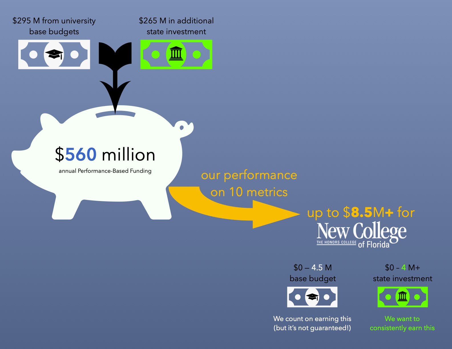{width=100% height=100%}
### What are the metrics? {data-commentary-width=390}
For 2021-22 funding, our performance will be measured on the following 10 metrics:
```{r PBF_metrics_list}
metric_names %>%
select(-name_short) %>%
filter(!(metric %in% c("8a", "9"))) %>%
rename(name = name_long) %>%
gt() %>%
tab_header(title = "PBF Metrics") %>%
tab_options(
table.font.size = px(14L),
column_labels.background.color = "#0066CC",
column_labels.font.weight = "bold",
data_row.padding = px(6)
) %>%
cols_align(align="right", columns = vars(metric)) %>%
tab_source_note(
source_note = md("*Why are there 11 metrics? Metrics 9a and 9b are new 5-point metrics for 2021-22.*
*Is there a metric 8a? Yes, but it does not apply to New College... yet.*"))
```
***
We receive two scores for each metric:
* 0-10 **excellence** points
+ our performance compared to [benchmarks](https://www.flbog.edu/wp-content/uploads/2020-Benchmarks.pdf) from the State University System of Florida strategic plan.
* 0-10 **improvement** points
+ +1 point for each 0.5% improvement from the previous year
Our final score for each metric (displayed in the table) is the **higher** of the excellence and improvement points.
Our total score, then, can range from 0-100 points.
### What total score do we need to earn to receive PBF funds?
Our goal is to score **at least 70 points each year** without having our score drop two years in a row.
The allocation process has become complex. This is my understanding:
* To earn \$8.5$M ($\$4.5$M from our base budget + $\$4$M in additional state investment), we must:
+ score among the top 3 schools, or
+ **score > 70 points** without having two consecutive years of declining scores
* To earn \$6.5$M ($\$4.5$M from our base budget + **half** of the $\$4$M in additional state investment), we must:
+ **score between 60-70** points without having two consecutive years of declining scores, and
+ write an improvement plan that is approved by the Board of Governors
* To earn "less than 100%" of our $\$4.5$M in base funding plus **half** of the $\$4$M in additional state investment, we must:
+ **score < 60 points** without having two consecutive years of declining scores, and
+ write an improvement plan that is approved by the Board of Governors
* If our score drops for two consecutive years, we will need to write an improvement plan to earn any of the state investment.
Funds not allocated to low-performing schools are allocated to the highest performers, so **it's possible for New College to earn more than $8.5M each year.**
Satisfaction {data-orientation=rows data-icon="fa-smile"}
=======================================================================
Row
-----------------------------------------------------------------------
### Choose Again {.no-title}
```{r}
# Select final non-missing value
item <- "nsse"
last <- last(na.omit(satisfaction$result[satisfaction$item==item]))
describe <- "% would choose NCF again"
valueBox(last, caption = describe, icon = "fa-redo",
color = ifelse(last >= 90, "rgba(43,159,120,.4)",
ifelse(last >= 75, "rgba(240,229,75,.4)",
ifelse(last <= 75, "rgba(214,100,30,.4)",
"#ffffff"))))
```
### Educational Experience {.no-title}
```{r}
item <- "nsse2"
last <- last(na.omit(satisfaction$result[satisfaction$item==item]))
describe <- "% rating overall experience as good"
valueBox(last, caption = describe, icon = "fa-user-graduate",
color = ifelse(last >= 90, "rgba(43,159,120,.4)",
ifelse(last >= 75, "rgba(240,229,75,.4)",
ifelse(last <= 75, "rgba(214,100,30,.4)",
"#ffffff"))))
```
### Academic Experience {.no-title}
```{r}
item <- "bss1"
last <- last(na.omit(satisfaction$result[satisfaction$item==item]))
describe <- "% satisfied with academic experience"
valueBox(last, caption = describe, icon = "fa-user-graduate",
color = ifelse(last >= 90, "rgba(43,159,120,.4)",
ifelse(last >= 75, "rgba(240,229,75,.4)",
ifelse(last <= 75, "rgba(214,100,30,.4)",
"#ffffff"))))
```
### Non-academic experience {.no-title}
```{r}
item <- "bss2"
last <- last(na.omit(satisfaction$result[satisfaction$item==item]))
describe <- "% satisfied with non-academic experience"
valueBox(last, caption = describe, icon = "fa-star",
color = ifelse(last >= 90, "rgba(43,159,120,.4)",
ifelse(last >= 75, "rgba(240,229,75,.4)",
ifelse(last <= 75, "rgba(214,100,30,.4)",
"#ffffff"))))
```
Row {.tabset .tabset-fade}
-----------------------------------------------------------------------
### Overall
```{r, fig.width=8, fig.height=4}
satisfaction %>%
filter(item=="nsse") %>%
ggplot(aes(x = year, y=result)) +
geom_line(color="#0066CC", size=1.5) +
geom_label(data = . %>% filter(interpolated==0),
aes(label = result),
size=3, fontface="bold", fill="#0066CC", color="#FFFFFF",
label.padding = unit(0.25, "lines"), label.size = 0.15) +
labs(title = "% who would choose NCF again", y=NULL,
x = "Graduating Class") +
geom_line(aes(x = year, y = goal), color="grey50",
alpha=0.7, size=1, linetype="21") +
geom_label(aes(x = year, y = goal, label = sprintf("%0.0f", round(goal,0))),
size=3, fill="gold", color="grey50",
label.padding = unit(0.15, "lines"), label.size = 0.1) +
scale_x_continuous(expand = c(0,0), breaks=seq(2002, 2024, 2),
minor_breaks=seq(2002, 2024, 1)) +
scale_y_continuous(expand = c(0,0), breaks=seq(0, 100, 20), minor_breaks=NULL) +
coord_cartesian(ylim = c(0,100), xlim = c(2001.5, 2024.5), expand = TRUE) +
theme(
plot.title = element_text(color="#000000", size=12),
axis.title.x = element_text(color="grey40", size=11),
axis.title.y = element_text(color="grey40", size=11),
axis.text.x = element_text(color="grey40", size=11),
axis.text.y = element_text(color = "grey40", size=11),
legend.position = "none",
panel.grid.major = element_line(colour = "white"),
panel.grid.minor = element_blank(),
panel.background = element_rect(fill = "grey95"))
```
### Educational Experience
```{r, fig.width=8, fig.height=4}
satisfaction %>%
filter(item=="nsse2") %>%
ggplot(aes(x = year, y=result)) +
geom_line(color="#0066CC", size=1.5) +
geom_label(data = . %>% filter(interpolated==0),
aes(label = result),
size=3, fontface="bold", fill="#0066CC", color="#FFFFFF",
label.padding = unit(0.25, "lines"), label.size = 0.15) +
labs(title = "% who think the entire educational experience was good", y=NULL,
x = "Graduating Class") +
geom_line(aes(x = year, y = goal), color="grey50",
alpha=0.7, size=1, linetype="21") +
geom_label(aes(x = year, y = goal, label = sprintf("%0.0f", round(goal,0))),
size=3, fill="gold", color="grey50",
label.padding = unit(0.15, "lines"), label.size = 0.1) +
scale_x_continuous(expand = c(0,0), breaks=seq(2002, 2024, 2),
minor_breaks=seq(2002, 2024, 1)) +
scale_y_continuous(expand = c(0,0), breaks=seq(0, 100, 20), minor_breaks=NULL) +
coord_cartesian(ylim = c(0,100), xlim = c(2001.5, 2024.5), expand = TRUE) +
theme(
plot.title = element_text(color="#000000", size=12),
axis.title.x = element_text(color="grey40", size=11),
axis.title.y = element_text(color="grey40", size=11),
axis.text.x = element_text(color="grey40", size=11),
axis.text.y = element_text(color = "grey40", size=11),
legend.position = "none",
panel.grid.major = element_line(colour = "white"),
panel.grid.minor = element_blank(),
panel.background = element_rect(fill = "grey95"))
```
### Academic
```{r, fig.width=8, fig.height=4}
satisfaction %>%
filter(item=="bss1") %>%
ggplot(aes(x = year, y=result)) +
geom_line(color="#0066CC", size=1.5) +
geom_label(data = . %>% filter(interpolated==0),
aes(label = result),
size=3, fontface="bold", fill="#0066CC", color="#FFFFFF",
label.padding = unit(0.25, "lines"), label.size = 0.15) +
labs(title = "% satisfied with academic experience", y=NULL,
x = "Graduating Class") +
geom_line(aes(x = year, y = goal), color="grey50",
alpha=0.7, size=1, linetype="21") +
geom_label(aes(x = year, y = goal, label = sprintf("%0.0f", round(goal,0))),
size=3, fill="gold", color="grey50",
label.padding = unit(0.15, "lines"), label.size = 0.1) +
scale_x_continuous(expand = c(0,0), breaks=seq(2002, 2024, 2),
minor_breaks=seq(2002, 2024, 1)) +
scale_y_continuous(expand = c(0,0), breaks=seq(0, 100, 20), minor_breaks=NULL) +
coord_cartesian(ylim = c(0,100), xlim = c(2001.5, 2024.5), expand = TRUE) +
theme(
plot.title = element_text(color="#000000", size=12),
axis.title.x = element_text(color="grey40", size=11),
axis.title.y = element_text(color="grey40", size=11),
axis.text.x = element_text(color="grey40", size=11),
axis.text.y = element_text(color = "grey40", size=11),
legend.position = "none",
panel.grid.major = element_line(colour = "white"),
panel.grid.minor = element_blank(),
panel.background = element_rect(fill = "grey95"))
```
### Non-academic satisfaction
```{r, fig.width=8, fig.height=4}
satisfaction %>%
filter(item=="bss2") %>%
ggplot(aes(x = year, y=result)) +
geom_line(color="#0066CC", size=1.5) +
geom_label(data = . %>% filter(interpolated==0),
aes(label = result),
size=3, fontface="bold", fill="#0066CC", color="#FFFFFF",
label.padding = unit(0.25, "lines"), label.size = 0.15) +
labs(title = "% satisfied with the non-academic experience", y=NULL,
x = "Graduating Class") +
geom_line(aes(x = year, y = goal), color="grey50",
alpha=0.7, size=1, linetype="21") +
geom_label(aes(x = year, y = goal, label = sprintf("%0.0f", round(goal,0))),
size=3, fill="gold", color="grey50",
label.padding = unit(0.15, "lines"), label.size = 0.1) +
scale_x_continuous(expand = c(0,0), breaks=seq(2002, 2024, 2),
minor_breaks=seq(2002, 2024, 1)) +
scale_y_continuous(expand = c(0,0), breaks=seq(0, 100, 20), minor_breaks=NULL) +
coord_cartesian(ylim = c(0,100), xlim = c(2001.5, 2024.5), expand = TRUE) +
theme(
plot.title = element_text(color="#000000", size=12),
axis.title.x = element_text(color="grey40", size=11),
axis.title.y = element_text(color="grey40", size=11),
axis.text.x = element_text(color="grey40", size=11),
axis.text.y = element_text(color = "grey40", size=11),
legend.position = "none",
panel.grid.major = element_line(colour = "white"),
panel.grid.minor = element_blank(),
panel.background = element_rect(fill = "grey95"))
```
```{r eval=FALSE}
# Row {.tabset .tabset-fade}
# -----------------------------------------------------------------------
#
# ### Test
#
# ### Two Plots
#
# You should see two plots.
#
# #### Plot1: wt, hp
#
# ```{r}
# plotDf <- mtcars[,c("wt","hp")]
# plot(plotDf)
# ```
#
# #### Plot2: mpg, disp
#
# ```{r}
# plotDf <- mtcars[,c("mpg","disp")]
# plot(plotDf)
#
```


